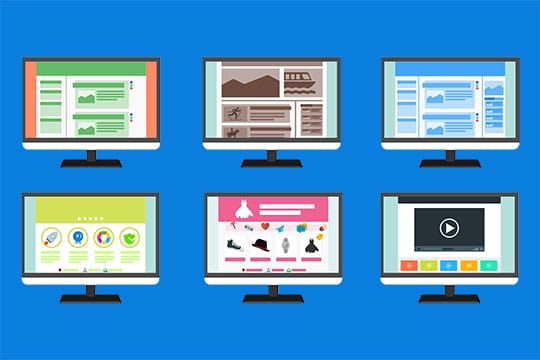
In this article, we will try to rate website design as a non-designer. We will consider the design, as a result of the design – the appearance and functionality of the site. The ideal website should be simple, convenient, understandable, beautiful and most importantly – selling (and not necessarily selling only products, the site can “sell” ideas).
1. Does the site design make the right impression on visitors?
If you want to buy cheap things, then you will go to clothing markets, not boutiques. Or if you want to buy quality cosmetics, you are unlikely to look for it in the stalls in the underpass.

The same is websites – if you sell inexpensive goods, the chic colorful design will scare away visitors. And if you, for example, provide quality and expensive services, a simple site made by a familiar student can make you doubt the reality of your proposal. The design of the site must match your business!
Recommended for you: Key Factors to Add to Your Website Design to Generate More Leads.
2. Should the site follow the corporate identity of the company?
Imagine the website Amazon made in red and yellow colors. Agree – this is impossible. The design should adhere to the corporate identity of the company!
3. Does the site correspond to the advertising strategy of the company?
For example, Volvo positions its cars as the safest and builds its advertising campaigns accordingly. The Volvo website should also emphasize “safety”.
4. Does the website design help to present products at their best?
Beautiful design is a very good thing, but it’s more important to present the products beautifully.

If you have bright and contrasting colors in your design, the photos in such a frame will seem fainter than they really are. And vice versa, if the design is made in pastel (preferably gray) tones, the photos will seem brighter and more intense.
5. Is it easy for visitors to your site to find the information they need?
If you have 5 pages on your site, there is no problem with information placement as a rule; you just put the menu with the names of these pages and that’s all.
And if you have 100 pages or 10.000 pages? In the case of a large site, there is a need to think through the structure of the site, the names of sections and subsections so that visitors were clear where to look for the information they need. Moreover, a website maintenance plan is important if you have a large website.
6. Is the design of the site in a uniform style?
If the site is too different design for different pages, visitors may feel that they have moved to another site. As a rule, all pages of the site have common elements (logo, menu, colors, fonts).
7. Does the design match the colors?
There is a whole science of combining different colors. On color.adobe.com you can see different color combinations.
8. Are the fonts on the website compatible?
The fonts on the site must match each other. Incorrectly selected fonts create a feeling of inaccuracy and dilettantism. The best way to combine fonts is to write an article with practical tips and examples.
9. Are the design elements well drawn?
I think that you have met websites where the lines are unclear, with notches, where the shadows are such that there is a feeling of dirt, where the photos are blurred and faded. Such sites immediately cause a feeling of “unprofessionalism” of their creator. Simple in design, but neatly executed sites always look better than tricked-out but poorly drawn.
10. How carefully worked out the details?
In a quality design, there are such trifles, which are more felt than realized. These can be carefully drawn glare, barely noticeable background textures, pixel-by-pixel drawing of letters in the logo and headings. Compare the work of professionals and novice web designers and you will understand a lot about the details.
11. Is the information easily perceived on the site?
The small font looks more beautiful, but it is more difficult to read. The background image under the text can make the site not only more beautiful but also more difficult to read the text. See if the information you want to tell visitors to your site is easily perceived?
12. Are announcements and advertising blocks easily perceived?

If you overdraw with special offers, the site becomes like a Christmas tree. When the site has too many sources of attention (announcements, special offers, advertising), a person ceases to perceive them.
You may like: How to Build, Design and Market a Killer Website for Your Startup Business?
13. Are the graphic symbols used in the design clear?
Often sites use different icons to facilitate the perception of information. Use common symbols. If you replace the basket in the online store icon bag, not all your visitors will understand it.
14. Is it easy to find a phone number and other contact information?
When a visitor to the site wants to contact you, it is very important that they find your contacts easily. It is often the case that phones and e-mails are only on the “Contacts” page. It is desirable that phones were both at the beginning and at the bottom of the page.
15. Is it clear how to order and buy goods in the online store?
One of the barriers during the purchase in the online store is the uncertainty of the buyer that he will make the right order and get exactly what he wants. It is necessary that the site was explained as clearly as possible, how to make an order and how the buyer will get the purchased goods.

The main points to which it is necessary to pay attention: types of payment, methods, and terms of delivery, guarantees, and terms of exchange (return) of defective goods.
16. Are there any original graphic elements in the design?
The original graphics create a sense of individuality and exclusivity. It can be both simple icons and various graphic elements.
Site quality assessment through URL analysis
CNCs have already become a classic, a good tradition, which should not be neglected. It is desirable to make CNCs even for news sections. Suddenly, some of the news will contain key requests that will help to attract target customers. This is useful for promotion.
Make sure that there are no special symbols “?”, “=”, “&” in the URL. For example, a question mark in a page address is likely to mean that the same content is uploaded to other similar addresses. That is, depending on the CMS on which the site is implemented, search engines can detect up to five takeups of pages on your Internet resource. Duplicate pages reduce the value of the site for the search engine. And if you consider that in fact, they are not on your Internet resource, it is doubly unpleasant.

There are cases when dynamic URLs and all these signs in their composition are allowed. These are the pages that are formed after applying filters. For example, when you need to select a product from the entire range of online stores by certain parameters. Pages formed as a result of selection are temporary, non-indexable and allow such characters. But on a particular product card, there should be no question marks in the address of the page.
Site security
An important value that the customer often ignores because he cannot understand it. Correspondingly, we can not give an estimate. We just have to take the word for it and hope that the site will not be hacked by cybercriminals.
There are several small “tricks” that you can use to roughly determine the vulnerability of an Internet resource. This is not enough for a complete picture. But at least something.
If a user can download a file on the site, a list of file types that are allowed for this action should be defined. What formats can be downloaded should be reported somewhere near the button for downloading. Try downloading the wrong file format and make sure that the system checks to see what is being written to it.
The “‘” symbol helps to check the site for SQL vulnerabilities. Put it somewhere at the end of the page address. For example, change the line like my-site/catalog/clothes to my-site/catalog/clo’thes/ Site should give a 404 error. The site should not give out any warnings or other types of errors. Also, the site should not load any other page instead of the one you request.
You may also like: SEO and Web Design: How to Make Sure They Go Hand in Hand?.
Checklist of ways to evaluate the quality of the site

How to quickly determine the quality of the site? Here is a checklist of the above methods:
- Evaluate how well the details are drawn.
- See how many errors the CSS validator generates.
- Check the number of HTML validity errors.
- Estimate page loading speed and correct display on all types of devices.
- Browse the site without using filters or other search tools. See if there are any “?”, “=”, “&” signs in the page address.
- Try to put an apostrophe in the address of the page and see if the site will give 404.