Creating a landing page to generate more leads has always been a good idea. However, the number of leads you generate should not be your top priority. Instead, you should focus most on the quality of leads. In other words, it’s all about quality over quantity. So, if you’re finding yourself in a situation where most of your generated leads eventually go cold, you might need to focus on landing page optimization.
What is Landing Page Optimization (LPO)?

LPO is a subgroup of CRO (Conversion Rate Optimization). By using methods such as A/B testing, landing page optimization focuses on improving the elements of a web page in order to increase conversions.
Recommended for you: How to Write Compelling Content for a Landing Page?
Why are you not converting leads?

There are many reasons that explain why the leads you’re generating don’t convert. First and foremost, not understanding your target audience could be your big issue here.
After all, a landing page that doesn’t align with who your target audience is and what they want doesn’t really stand a chance in converting leads.
Other issues that could be affecting your conversion rate include poor design, ambiguous CTAs, and poor headlines. If any of these pose a problem, you might want to consult with a professional website design agency and sort out this issue.
How do you identify these problems?

Well, the short answer is by gathering as much data as you can. Tools such as heat maps or scroll maps give you the ability to study how users behave within your site, therefore, helping you spot potential issues.
For example, heat maps allow you to visualize what elements are being clicked the most. Maybe your CTA buttons are not that effective. In which case, you might need to change them up a bit.
Or users might focus most of their attention on an unimportant element within the page. If so, you might want to move that element further down the page so you can let visitors focus on what actually matters.
Scroll maps, on the other hand, help you see which parts of the page users tend to scroll over and where they usually stop scrolling.
So, how can you optimize your landing page so it generates quality leads? Follow these tips.
Landing Page Optimization Tips

1. Optimize your forms

Forms basically act as a filter for the leads you generate. Think of it this way: Anyone can visit your web page, including people who may not actually be interested in what you have to offer.
Pursuing people who aren’t likely to convert isn’t cost-effective. You need to go after the leads you know are most likely to convert. But how do you know which visitors are the most likely to purchase your products or services?
Enter forms:
Asking for too much information can deter potential customers, so be sure to have the visitor fill out just enough information to let you know whether the lead is worth it or not.
Don’t forget to give your visitors an incentive to fill in the form. Give them something in return, such as a coupon code, or show them how they can benefit from completing the form.
You may like: 12 Landing Page Design Mistakes You May Be Making.
2. Make your forms stand out

Speaking of forms, you need to design them in a way so they catch the user’s eye. Remember, your forms act as part of your funnel. The more potential leads you put in one end of the funnel; the more quality leads will come out of the other end.
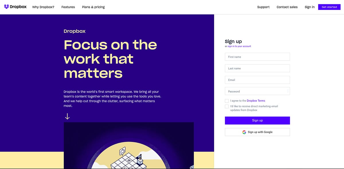
One of the best examples that comes to mind is Dropbox.
Notice how the form takes up around a quarter of the screen on the desktop. Not only that, but it’s also colored differently compared to the rest of the page, so it can catch the users’ attention.
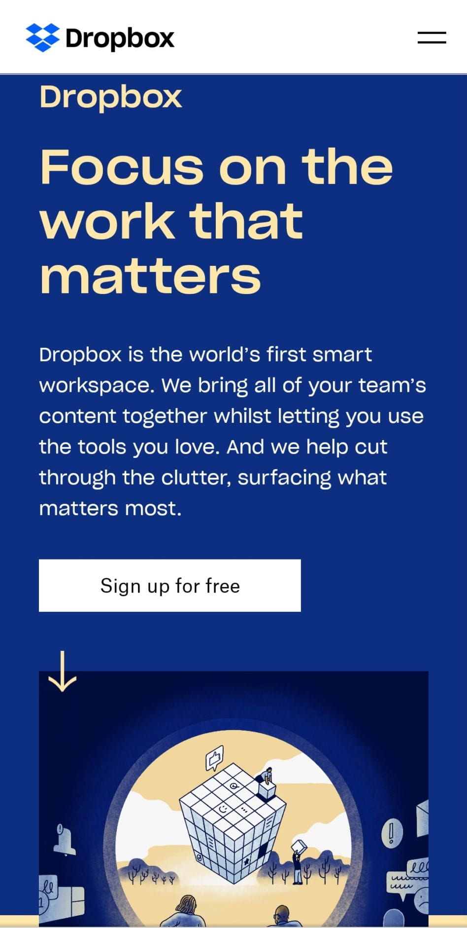
Now, on mobile, there’s a different story. That’s because of the lack of screen space available. However, they still managed to do a pretty good job at enticing users to sign up.
Notice how on mobile, the form is hidden behind a call-to-action button. Now, just as with the desktop version of the web page, they made use of contrasting colors to drive the users’ attention to where it’s needed.
Remember when we talked about giving users an incentive to fill in the form by giving them something in return or by highlighting the benefits of signing up?
Well, that’s exactly what Dropbox did here. In order to convince users that clicking on the button and filling in the form is actually worth it, they emphasized that signing up is free.
3. Work on your CTAs

Speaking of call-to-actions, they are just as important as the forms themselves. After all, CTAs are partly what gets the users to actually fill in forms.
CTAs show off the reward and to users, completing forms is how they can actually obtain that reward.
Your calls to action need to be clear, unambiguous, catch people’s attention and motivate users to fill in the form.
As we’ve previously mentioned, contrasting colors are a great way to make your CTA buttons stand out. Let them stand alone from the rest of the page. That will grab the users’ attention straight away.
CTAs you could use include phrases like “Sign up for free” or “Download now.” Don’t focus on fancy or complex words. Keep your CTAs concise and easy to understand. Getting feedback from your visitors might help you optimize the CTA buttons and improve the UX on your website.
4. Establish trust

Even if you’ve done a great job at attracting visitors’ attention and encouraging them to fill in the forms, they may still hesitate. After all, you’re asking people for their personal information.
Let your visitors know that you’re trustworthy. You can do this by adding trust badges or by including logos of the companies you are collaborating with.
Focus on social proof as well. Adding reviews or testimonials from your previous customers can help establish trust with new potential customers. Keep in mind, potential leads will need reassurance and they’re most likely to get that from people who have previously interacted with your company.
5. Keep all important information above the fold

What do we mean by the fold? It’s the point where a user needs to scroll down the page to get more information. So, make sure to keep all relevant information above that point.
This includes headlines, CTA buttons, the value proposition, the form, etc. It all needs to be kept above the fold, so this content is the first thing users see once they land on your page.
6. Simplify the design

Focus on a minimalist design with plenty of white space to allow your content to breathe.
The layout needs to be clean and the copy should be short and straight to the point. Otherwise, visitors’ attention will be dispersed in multiple directions, eventually driving them away from what’s actually important: your forms and call to action buttons.
7. Add visual content

Speaking of keeping the design of your landing page simple, photos or videos are both great ways to send a message to visitors that otherwise would span across entire paragraphs of text.
However, keep in mind that the images or videos you showcase need to be in correlation with both the form and the copy within the page. Ensure brand consistency throughout your site, with each type of content you create.
8. Do A/B testing

Knowing what’s actually working and what’s not is key to landing page optimization, which is why it’s important to test certain elements from time to time.
See what headlines or which CTA buttons are better at grabbing attention, test forms with a varying number of fields and see which ones get filled in the most, etc.
However, keep in mind to test only one thing at a time. That way, you’ll be able to easily figure out what’s working and what’s not.
You may also like: Quick Tips to Boost Landing Page Conversion Rate.
Takeaways

These tips can help you successfully optimize your landing page in order to improve the quality of your leads. Remember, before diving headfirst into the optimization process, try to first identify potential problems.
Make sure to make use of heat maps and scroll maps so you can study how users behave on your site, what elements are being clicked the most and which parts of the page users typically scroll over.
When it comes to optimization, keep in mind to put an emphasis on your forms. Make them stand out and determine the number of form fields you actually need.
Also, offer users some incentive to fill in the forms. Highlight some benefits or give them something in reward, while establishing a sense of trust with them as well.