Most often, people don’t think of the art of web designing like other designing arts. Due to its association with Information Technology, it is considered more technology than art.
You might have heard about a lot of factors you need when formulating the design of your websites like audience requirements and priorities, user experience, and devices to run your website.
But a very important but often missed factor is to understand and know the evolution of web designing so that you always produce most modern and up-to-date designs. It will also help you predict the directions of future web designs and become a trendsetter by adopting them before anyone else does.
Here is a quick look on the history of Western world architecture and how it has impacted and may further impact the future of web designing.
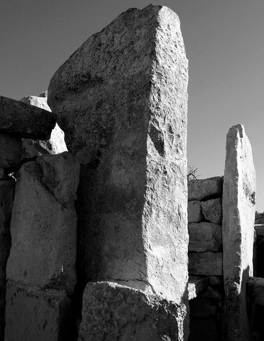
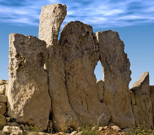
Simple Neolithic Designs
HTML was launched in 1990 creating a buzz around the world as the first markup language to build websites. In 1991, the first web page with HTML was created by Berner Lee.
It is still one of the most visited pages globally as a monument in the history of information technology.
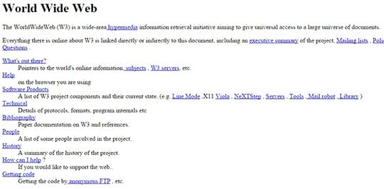
With a very fundamental structure, it shows that early internet was like a directory with few sections and small lists of items as electronic yellow pages. A clear look of this web page shows that website development has not much changed in terms of basic structure.
Words highlighted in blue were used to list the headings. Now these are used to direct the search engine crawlers and define search engine ranking as keywords.
Proportioned and Ordered Classical Designs
Proportions, hierarchies, and order of stones in the classical period of Western architecture redefine similar features in web designing. In the classical period, stones were differently carved and used to define specific purposes in their respective areas.
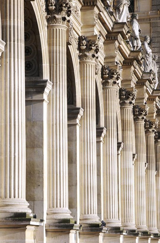
Similarly, table-based websites were introduced in the mid-90s to aid early adopters or offices with internet connections. The foundation of web designs including scales, navigational sidebars, headers, footer, and body content, which still defines the basic structure of modern web designing today.
User-friendly web designing includes graphical elements. In classic architecture times, stone carvings were based on material mimicry. For example, wooden beams were mimicked with stone triglyphs. Nowadays 3D buttons are used to mimic physical buttons.
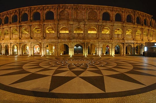
Rounder Romanesque
The roman period includes thicker walls, rounded corners, and divided sections. This period well-defined web designing during the late 90s.
With more buttons and menus, round graphical designs became more popular during the late 90s. Space Jam website is a good example and it is still live as a monument in the history of information technology.

Romanesque buildings were simpler with less designing but more defining sections. Similarly, web designs during the late 90s were a little heavier but more focused for better user experience.
Ornate Gothic Designs
With more detailing, ornate Gothic designs were mesmerizing and captivating. In the late 1990s, a few months before the start of millennia, CSS, Flash, and PHP were introduced as new milestones in the history of web designing.
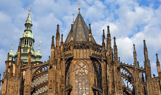
Although, Flash is not much used today due to its incompetence with SEO, but it is the trendsetter and foundation of modern web designs.
Evolution of glass web designs and use of more pixels mesmerized the users with definitive colors and defining web features, just as Gothic architecture still mesmerizes us.
Renaissance
One of the most adored periods of Western arts is Renaissance. Although the designs had become simpler and precise yet they looked beautiful and defining as compared to complicated but enthralling Gothic designs.
The Renaissance of web designing started during ‘flat design’ era. This is the era of different screen sizes in which things need to be simpler, defining and easier-to-use. Now the websites are not built in terms of functionality but for the ease of users.
The era of the mid-2000s or Web 2.0 defines web Renaissance. This is the era when the internet had already penetrated its roots all over the world and desktop computers and laptops were used in the houses. Before the web, search engines came forward to take charge of making the web user-friendly by introducing search engine ranking tools and techniques.
User experience became more important than the design of the website.
The boom of smartphones started after 2010. As the world shrunk on human palms and its usability extended from offices to bus stops and classrooms, there was a dire need to add human content.
Therefore, maintaining Western Renaissance designs (i.e. simpler, clutter-free and elegant), most modern web designs are highly responsive to different screens. These are simple to use and are communicative as storytellers i.e. they guide the users with arrows and scroll techniques. Parallax animations and visual engagement have completed the package of web user-friendliness.
The Future of Web
If web designs continue growing and moving on in the similar pattern, the future of web designing would be more than interesting.
Irrespective of the design, there are a few trends that have not been interrupted since the landing of the internet. These trends will continue in the same way in coming future.
- High speed
- User-friendliness
- Human emotion and the web interaction
- More brand and consumer interaction
- Lesser browsing and more mobile devices
- Lesser privacy and more networking
- More small business opportunities with designs supportive to online sales
- More eCommerce
Baroque
Pick all architectural periods and twist them together to produce a new design i.e. Baroque design. In this architectural period, all Western arts were combined to produce captivating designs.

If web designing follows Baroque trends, the websites may become more functional than user-friendly. Web designs may also become more complicated for users.
As a fact, Baroque trend was adopted by shopping cart designers. Shopping cart abandonment rate was 60% in 2006 which grew to 74% in 2012. One of the primary reasons of increasing rate of shopping cart abandonment was complicated design.
After 2012, mobile eCommerce grew and the designers simplified shopping carts which helped cut shopping cart abandonment rate by 6%. It is 68% in 2015.
The need of simplicity refers to the need of Neoclassicism in web designing.
Neoclassicism
Once we have completed a 360-degree circle of anything, we prefer moving back to retro designs and live back our glorious past.
If designs become more complicated and the sand of web designing starts running out of fists then we may move back to veteran 90s web designs.
It would definitely be cool for people who have lived that era but what if web designing adopts current state of architecture?
It is difficult to assume this future of web but we can definitely give it a try!
This article is written by Sandeep Sharma. He is a creative head at India Designers. He has more than 15 years’ experience in the web designing domain. He is leading the team of more than 25 web designers in the company. You can follow him on Twitter.


