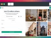
A home page is a landing page. It is the page that a visitor may “land” on after conducting an organic search on Google. And, if you have a single product or service and only one or two conversions you want from visitors, your home page may be the only landing page you need. But if you are trying to attract traffic from several sources and you are doing it by special offers and such, your homepage cannot and should not handle all of that. This and 12 other mistakes should be avoided as you create your landing pages.
Mistake #1 – Multiple Offers on a Single Page
You will need standalone pages that focus on single purposes – things of value that you are offering to a visitor that the visitor expects to be there when they follow the link you gave. For every value offered, you need a separate landing page. Not doing this is a common error.
If you are trying to “crunch” multiple offers on a single page, you are confusing your visitor who must now search for the specific values/he came to the page to get.
This is so easy to fix – a unique page for each conversion you want.
Example:
Education.com is a site that offers a variety of educational materials for teachers, parents, and students. Members and visitors alike can purchase workbooks, lessons, worksheets, etc., and members receive a permanent discount. Visitors to the site can take advantage of offers by leaving an email address. The company re-attracts those visitors with targeted emails, offering free items. A recent email told readers that they could get some free worksheets. By clicking on the link, the readers got only one thing – exactly what they came to get – free worksheets to download. By scrolling down on this landing page, visitors could choose a grade level and subject area and get their free items.
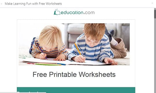
Note: There were no others things being offered and no clutter to confuse. Perfect.
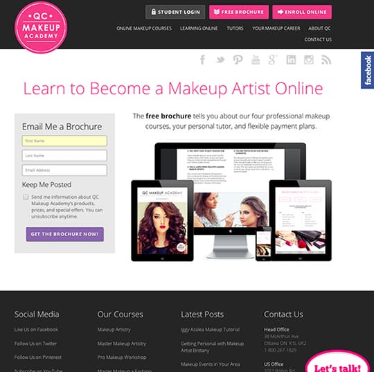
Mistake #2 – CTA Button Doesn’t Sit By Itself
This is another problem when too much is put on a landing page. The CTA button for the conversion you want is lost in the clutter. Visitors don’t want to have to search for the button that gets them what they came for. Make it prominent and large enough to find quickly.
It is pretty hard to know what the point is of this landing page. Actually, it is to get a free brochure. There are several mentions of the brochure on the page, but the CTA button is small and a bit difficult to find because the focal point of the page is the images and there is so much else to read and click on.
Compare the page with this one from PayPal:
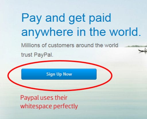
Only one message and only one CTA prominently displayed.
Mistake #3 – CTA Buttons Often the Wrong Color
Color psychology is real and it is a part of neuroscience research. If you want to optimize your chances for conversions, use the colors that best relate to what you are offering/selling. Here is a simple, easy-to-use infographic on colors for CTA buttons.
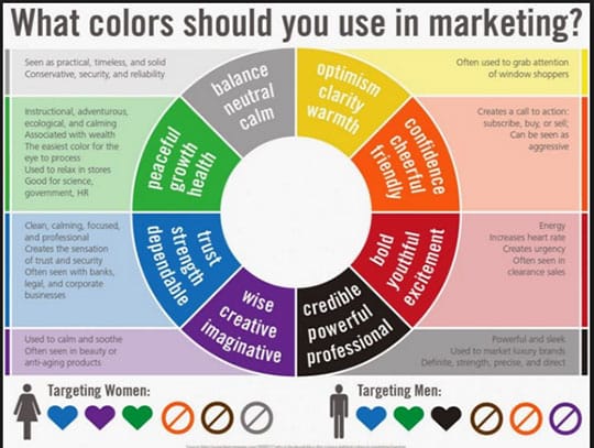
If you are a B2B business targeting career professionals, you might want to use a blue or black button; a workout equipment business might want to use red. Green is “universal” color because it is the easiest for the eye to process.
Mistake #4 – Page Does Not Explain Anything
First and foremost, a landing page should tell the visitor what to do to achieve the purpose for which they came to the page. It should also remind the visitor of what the business does and the problems it solves for customers/clients. If either of these two things is unclear, a visitor will likely bounce.
Basecamp is a company that provides software solutions for companies to manage projects when there are multiple people involved. This is just one of its many landing pages:
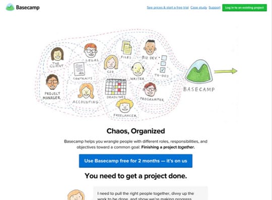
They clearly tell their story – what they do and the problem they solve for their clients. And their offer of a value is clearly stated – a free 2-month trial.
Mistake #5 – Not Using Language of the Customer/Client
It’s easy to get caught up in the jargon and the language of your business. But sometimes target customers don’t have all of that terminology “under their belts” when they seek solutions. As well, if the language and vocabulary do not “match” the typical customer, they will be less likely to have any “connection” with you.
Look again at the Basecamp landing page above. The company has a lot of sophisticated technology about “how” they have cloud services, and they could use a lot of language about dedicated and shared and hybrid options, none of which would be understood by a public relations manager who just needs to get projects completed. The language is simple, to the point, and in a vocabulary that will be understood.
Mistake #6 – Bad Typography
Simplicity is really the key to landing page typography. Ornate fonts that are difficult to read will take attention away from what you want the visitor to do.
How bad is this?
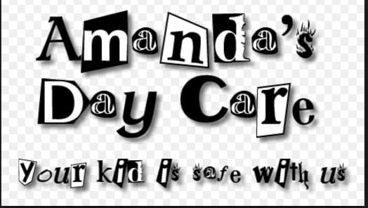
Obviously, the designers were trying to be “cute” and appeal through “kid” lettering, but it is difficult and irritating to read – the message is lost. And in black and white, it is totally unappealing and not “kid” oriented. Contrast this with one of Lego’s landing pages:

The typography is still in “kid” style but fully readable for any parent. And there is color – a nice bright color that appeals.
Mistake #7 – Images are Boring, Overbearing, or Don’t Relate
Visuals and images can be highly motivating and inspirational, especially on landing pages. But they have to create some excitement. Here is a landing page for a business that manages rental property and solicits renters for its properties.
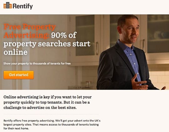
This page shows perhaps a company employee showing a piece of property to a renter – about as boring as it can get and certainly doesn’t create an exciting user experience at all. If they are trying to inspire clients to list their properties with the company, then happy renters are what they need to show.
Mistake #8 – Poor Use of Testimonials
While you certainly don’t want to fill a landing page with testimonials (remember, the visitor is there for a single purpose – to get what s/he came for), one or two can give “social proof” if done correctly. Testimonials with first names only and no photos are suspect – perhaps you wrote them yourself. Here is what should happen:
- Ask customers for testimonials and tell them you want to publish their names and a photo – no other personal information at all.
- Many customers will be happy to do this – they will like sharing their face and name in print with their friends.
- Put a couple on your landing page(s) – the names and actual pictures will add authenticity and credibility to you.
Mistake #9 – Not Designing Separate Pages for Personalization
As your business scales, you will have visitors, repeat visitors, and customers at all different places in your sales funnel. You need to appeal to all of them, but you cannot do this with a single landing page. You can separate them out into categories and use an email marketing service to send emails that drive them to different landing pages. A visitor whose email address you just received should be offered a free trial or a great discount. Visitors who have been back but still not purchased can be offered a discount on items they looked at, and loyal customers should be told of new products/services and offered special pricing because they are loyal customers.
If you are trying to reach everyone with the same email and the same landing page, you will lose traffic and conversions.
Mistake #10 – Opt-In Forms are too Cumbersome and Ask for Too Much Info
Ask yourself an important question. How much information do you really need for the conversion you want? Most often a name and an email address will be enough. If you are a B2B company, you may want the name of the company as well.
Remember, much of your traffic will come from people on mobile devices. They get the frustrated filling in form fields on those devices, and will often bounce without taking advantage of your offer because the form is irritating. Here is an example of a pop-up opt-in form from Neil Patel, founder of QuickSprout. He is a prolific writer on this site but places offer in the text of his posts and drive people to take advantage of upgrades and downloads. His ultimate purpose is to get clients for his content marketing consulting services, and getting contact information is the critical first step:
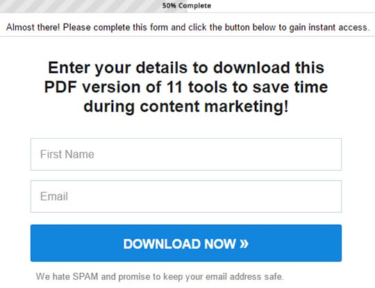
Note he asks only for first name and email address. It’s all he needs right now. He can send you a personalized email, call you by your first name, and present you with more offers.
Remember too that people are not happy to give out a lot of personal information on the first connection with a company – things like phone numbers and mailing addresses.
Mistake #11 – Slow Load
If you have not compressed your images, your landing page will load more slowly. And load times may differ with the device a visitor is using. The fix for this is simple – compress those images and test, test, test. Test every time you change anything. 1-2 seconds is optimal. Anything great than 3 seconds is a killer.
Mistake #12 – Not Including Sharing Buttons
When you offer something a solid value and have attracted a visitor who plans to convert, that visitor may be happy to share this offer with his/her community. If you make it easy by adding share buttons, that sharing is far more likely to happen. You then have all of that visitor’s community receiving word of you offer too – great brand spreading done for you by someone else.
As Always – It’s the User Experience That Counts
Landing pages have one purpose – to get a conversion or a sale. That is what you want, of course. But you must think in terms of what the visitor wants – the offer that was promised, a simple and easy way to get that offer, the speed of load, easy to understand language, visuals that excite and relate to the offer, and simple, non-intrusive opt-ins. Any of these mistakes can send a visitor walking; fortunately, they are easy to fix.
This article is written by Kerry Creaswood. She is a young and ambitious writer from Savannah, GA. She is interested in self-development, design, and marketing. Follow her: Facebook | Twitter | Google+ | LinkedIn.