As more people surf the internet from their mobile devices, a static website design that only looks good on a computer is no longer sufficient for businesses. When it comes to designing a website, you also need to take into consideration tablets, 2-in-1 laptops, and different smartphone models with varying sizes of screen. You can’t just slap your articles into a single column and let them go.
Responsive design enables your website to look great on all types of devices, including tablets, smartphones, and laptops. Higher conversions mean higher business growth, which is directly related to better user experience.
To begin with, let’s understand responsive web design before we jump into the frameworks.
What is responsive web design all about?
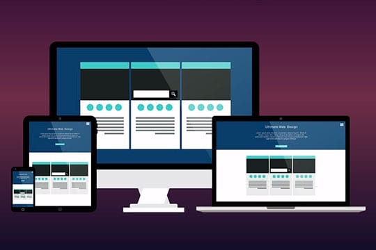
Responsive web design allows your content to display correctly on various devices with various screen sizes and window sizes. The result is that images are not too large for the screen, and mobile visitors are not forced to zoom in.
With responsive design, the ultimate goal is to prevent unnecessary zooming, scrolling, resizing, and panning of pages that occur when sites are not configured for different devices. Often, it is extremely tough to find your way around these sites, and you may even lose potential clients who become frustrated from trying to use them.
Furthermore, responsive website design eliminates the need to design on-demand mobile websites for smartphone users. It’s no longer necessary to create multiple websites for different screen sizes. Instead of optimizing numerous websites, you can create a single website that automatically adapts to various devices without user intervention with the help of responsive web design service providers.
Let us have a glance at this elaborate discussion of how responsive design works.
Recommended for you: How to Design a Website with PowerPoint Templates?
Why is responsive design significant for your business?
Perhaps you wonder why responsive design matters if you are new to web design, development, or blogging.
Answering that question is straightforward. You can’t design for just one type of device anymore. Approximately half of the world’s web traffic can be accounted for from the usage of mobile devices. In the 2021 first quarter, mobile devices (omitting tablets) generated 54.8% of global web traffic, steadily climbing around 50% since 2017.
More than half of your potential visitors browse the web on their mobile devices, so you can’t simply serve them a page designed for a desktop computer. This would be difficult to read and use and not conducive to a good user experience.
However, it doesn’t end there. Mobile devices are also the most common device used to visit search engines.
Today, mobile phones are pacing their way to become the most crucial media channel. Mobile advertising spending worldwide continues to climb despite the Pandemic. It was 223 billion dollars in 2020 and is estimated to surpass 339 billion dollars by 2023.
It doesn’t matter whether you use an organic method such as YouTube SEO or advertise on social media; most of your traffic will come from mobile.
Your marketing efforts will not yield optimum results in the absence of mobile-optimized landing pages and intuitive interfaces. Having low conversion rates will lead to fewer leads and wasted advertising dollars.
Take a glance at these advantages that explain why you should think of investing in a responsive web design.
Effectiveness in terms of cost
There are high chances that you might have to cope with huge costs if you are maintaining individual websites for your mobile and non-mobile customers. A responsive design can allow you to eliminate the need to pay for an additional mobile site. Regardless of the number of visitors and devices, you are just required to invest in one website design.
Flexibility
If your website is built with a responsive design, you can make adjustments quickly and easily. As a result, you don’t need to be stressed about updating and maintaining two websites. Flexibility is a great benefit when it comes to making a task and aesthetic design changes or corrections in any errors in your website, you are just required to do this once.
Enhanced User Experience
Website owners should prioritize user experience. The website they hold accountability for should provide easiness in terms of navigation so that people are willing to visit your website again. Having a website that loads slow on a mobile device or low-resolution images can make your business seem unprofessional to visitors.
An unprofessional company can never win anyone’s trust. There is no doubt that a responsive design will offer its users an improvised experience that will motivate them to give your company that right chance. Content can be viewed faster by eliminating zooming and scrolling, resulting in a much more positive impression in the minds of visitors.
Search Engine Optimization
An SEO strategy helps boost a company’s ranking on Google by appearing higher on Google search pages. As you get near to the top searches, the better your chances of gaining customers will be.
As mentioned, Google prioritizes sites that are mobile-friendly for search engine optimization. This means the responsive design can aid SEO. The effectiveness of responsive web design can help you boost search engine rankings as part of a holistic SEO strategy.
Ease of Management
Most businesses, especially smaller ones, are busy running their business and can’t regularly update their websites. However, using responsive design, you can handle every aspect of your website means that you can make changes yourself, quickly and easily. Further, if you have only one site, other marketing elements will be simpler to manage.
You may like: How to Web Design with Better Prototyping Tools that can Automate the Process for Designers?
Top CSS Frameworks for Responsive Web Design

Now it’s time to discuss the awaited topic of this blog post. Here, we have tried to state different authentic and responsive web design HTML and CSS frameworks that are available in the upcoming years. There is a listicle of many CSS frameworks that are free and reliable open source.
Undeniably, it might become a challenge when we try to do a complete comparative analysis among the responsive web design frameworks. Just like this, there are also some certain features that perfectly fit when it comes to faster designing and leaner websites, and on the other hand, some frameworks might provide you with a wide range of features and plugins. However, they might be bulky and more difficult to use. So that it becomes really easy for you to make a choice, there is a complete overview of several common frameworks.
Bootstrap

The Bootstrap Framework is a widely known HTML, CSS, JS framework which is great for developing responsive web projects that are also mobile-friendly. Bootstrap is an efficient and easy way to create front-end web pages. To get you on your way, they provide extensive documentation, demos, and example. Bootstrap 5 does a few essential things differently from Bootstrap 4, including no longer supporting jQuery and incorporating RTL support.
Bootstrap is a great option for web developers because it comes with pre-made components and utility classes. In addition to the free and premium bootstrap templates, there are also several UI Kits and details on the web that you can use for web development.
Tachyons

Tachyons are a different variety of utility-based CSS libraries which can easily lift hefty generations of a wide range of style attributes, thus you are not supposed to write a lot of CSS all by yourself. One of the special styles of Tachyons is light in weight, which offers a mixed advantage since you do not need an additional setup. Those who need a simple to use utility library can find this library helpful.
Foundation

As a front-end framework, Foundation is also worth noting. In addition to creating seamless websites, it can also create mobile and web apps and email templates. An average new user will have no problem learning Foundation and using it right away. In addition to media, library containers, navigation, layout, and so forth, this exceptional framework also has many other components. Furthermore, an extensive list of plugins available in Foundation allows developers to choose the one that best suits their needs.
Material Design for Bootstrap

Based on Bootstrap, MDB comes pre-configured with a Material Design look and feel. It comes with excellent CSS support, and it is compatible with a variation of JavaScript frameworks, such as jQuery, Vue, Angular, and React. The library is entirely free for everyone to use. However, a premium plan is available with themes, premade templates, and dedicated assistance for business customers.
Tailwind CSS

The Tailwind framework offers a modern utility-based procedure for developing responsive sites. There is an option of creating modern websites without the need to write CSS by making use of the library of utility sections. With the use of Tailwind CSS for cutting down the dimensions of your final CSS file, it will become beneficial to you, the other way around it might end up with a colossal file if using default arrangements. However, developers favored Tailwind because of its out-of-the-box design styles and ability to add styling to HTML elements.
Pure

When it comes to web projects, Pure stands out from the crowd. Pure has tiny footprints since it consists of only a few CSS modules. In addition to mobile development, this system also includes minimal style. The application can be designed in various types depending on the requirements. In addition to CSS components, Pure provides a comprehensive set of features. This CSS framework has also been enhanced with an excellent customizer, allowing developers to design CSS frameworks according to their interests and needs.
Montage

With Montage’s HTML5 support, you can quickly start building modern websites from scratch. The elements in Montage help build scalable websites that contain a wide range of features. It has its own exceptional features which make it unforgettable. Additionally, it has a declarative component model, declarative data binding, reusable components, HTML templates, and many other features. Additionally, these distinctive elements allow HTML5 applications to run on multiple devices, whether desktops or smartphones.
Semantic UI

Since its introduction, Semantic UI has become a popular framework. Since semantic design is easily embedded into other frameworks, third-party style guides can easily be integrated. Among the many semantic elements, you’ll find buttons, divers, collections, and loaders, such as breadcrumbs, forms, and so forth. A sophisticated range of modules is available, from pop-ups to dropdowns to sticky bones. Concluding this we can say that Semantic is one of the very strong frameworks for the development of websites. Due to its ease of use, it is prevalent among developers.
You may also like: Why Your Business Should Consider Custom Web Design?
Wrapping It Up!

Developing a responsive website requires good web design frameworks, which are the essential elements. Every framework that has been listed above can be used to start your web development project, right from HTML5 goodness to the basics of cascades. Moreover, be sure to pick the framework that best fits the requirements of your project before choosing any one of them.
This article is written by Helen Ruth. Helen is a skilled senior web designer at the prominent company Sparx IT Solutions. Creating aesthetically pleasing and easy-to-use websites is her expertise. Writing and blogging are some of her favorite free-time activities.


