There’s nothing worse than opening up an infographic and having your eyes bleed because you can’t read the text. It doesn’t matter how colorful, creative, or sexy that infographic is; if it’s impossible to navigate, then it will never get seen by anyone.
To avoid that problem, you have to pick the right fonts in your infographic maker. Now, this may seem trivial, but there are a lot of factors that go into picking the right font for graphic designers.
First off, what is the purpose of your infographic? Are you trying to educate people? Do you want to entertain them? Also, who’s your target audience? If you’re trying to educate high school students about Shakespeare and his influence on modern literature, then you should probably stay away from Comic Sans; that font was meant for babies.
Take a look at infographic design examples used by your animated infographic maker and see what fonts it uses. If you see the same fonts being used over and over again, chances are it’s because that font works well with most infographic maker online layouts.
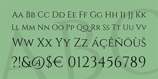
Now let’s get down to the nitty-gritty. There are literally thousands of fonts out there, but only a handful actually work well with infographic designs. The following list will give you an idea of what fonts you should be using when choosing a free infographic maker.
Garamond

Designed by Claude Garamond (wiki) in the 1530s, this font has stood the test of time and is still used today for anything that deals with literature, newspapers, magazines, or other materials where legibility is key. The only issue with it is that it’s hard to find because it’s not available in every font library out there.
Recommended for you: Top 12 Best Tools to Create your Own Well-Designed Infographics.
Proxima Nova

This is an excellent font that works well for creating sleek headlines while also working very well when paired with other fonts (which we’ll get into later). It can also be used for creating body copy, but just know that it looks best when used in headings.
Courier New

Another font designed by Claude Garamond, Courier is basically the same thing as Garamond except more for newspapers and other printed mediums. It’s a simple font that’s easy to read and is great for body copy when you’re looking for something with just a little bit more flair than Helvetica or Arial.
Mistral

A beautiful font, Mistral was designed in the 1950s by Roger Excoffon (wiki). It’s a great font for pairing with other, more complicated fonts which helps make your design look cohesive throughout.
Trebuchet MS

A favorite among graphic designers, Trebuchet has been used for everything from body text to titles and headings. There are tons of different styles you can pick from including light, bold, and italicized. The best thing about this font is that it’s available for both Mac and Windows so you don’t have to worry about compatibility issues.
Verdana

Built to be super legible, Verdana was designed by Matthew Carter (wiki) specifically for the web. It’s a great font that works well in both print and on-screen projects, making it a worthy investment if you’re looking for something that’s versatile.
Arial

Designed by Robin Nicholas and Patricia Saunders (wiki) back in 1982, Arial is basically Helvetica with rounded edges. The font was created for IBM’s bitmap font laser printers and has stood the test of time ever since. It’s an excellent font to use when creating body copy because it’s easy on the eyes and looks great on screen.
Helvetica

It’s basically the same thing as Arial except it doesn’t have rounded edges. Helvetica is an excellent font to use when creating headings but using it for body copy can make your work look unimaginative or, at worst, bland.
Gill Sans

Designed by Eric Gill (wiki) back in 1928, this font features a great mix of old-school aesthetics without seeming too formal. It’s a great font for creating headings and subheadings, but it works best with Helvetica or Arial when creating body copy.
Adobe Caslon Pro

Designed by Carol Twombly (wiki) in 1993, this is yet another beautiful font designed specifically for print projects. It can be used online as well, but its best quality is the fact that it creates a unique and cohesive design without ever looking too busy.
Impact

Although Impact looks like it belongs more in comic books than infographic designs, don’t let that fool you. This may be an unconventional font choice in an online infographic maker, but when used with the right colors and layout, this bold font can create a really dynamic design.
Cambria

When you want to create an infographic with a traditional feel, Cambria fits the bill perfectly. It’s another font designed by Steve Matteson (he does love his fonts, wiki) and is great for both body copy and headlines.
Comic Sans MS

Who would have thought that one of the most infamous fonts in history was also a great choice for creating infographics? This ‘comic book inspired’ font is perfect for headings, but it’s a little too cute and playful to use on body copy.
Blippo Sans

Designed by Naoki Takizawa back in 2011, this is another sans serif font that has really stood the test of time. It’s simple, easy to read, and works well for both headings and body copy. It’s available in bold, italicized, bold-italicized varieties as well as light and semi-bold if you’re looking to give your design a little more flair.
Aldo Novarese

Designed by Aldo Novarase (wiki) in 1968, this is another great serif font that works well for both body copy and headings. Its curvy edges give your design a unique appearance without making it look too overly busy or traditional.
Eras ITC

A fun font to use on infographic designs, Eras was designed by Robert Slimbach (wiki) back in 1984. It’s available in both regular and bold which means you can use the same font for both headings and body copy if you want.
Tahoma

Another Microsoft font, Tahoma is great for creating body text because of its legibility. It’s not ideal for creating headings though due to its lack of spunk or flare (no pun intended).
Lucida Console

If you want to create an infographic with a classic feel, Lucida Console is the way to go. It was designed by Bigelow & Holmes back in 1990 and has been used for both typesetting and creating infographics ever since.
Cambria Math

Designed by Kris Holmes and J. Lippincott Williams back in 2002, Cambria Math is another font that does its best work on body copy. It works well for headings too, but this typeface is great for infographics that contain complex scientific information or mathematical equations.
You may like: 5 Web Safe Fonts That You Can Use in Your Website.
Comic Neue

A modern take on the classic Comic Sans font, Comic Neue adds a little more spunk and playfulness to the original. It’s a great choice for creating infographics with a bit of humor or wit.
Eldorado

Designed by Carol Twombly in 1993, this is another popular choice for creating infographic designs that strike a balance between old-school and modern designs. It’s available in both bold and regular versions which gives you even more flexibility when creating your infographic.
Andale Mono

Designed by Steve Matteson, Andale Mono is another font that was created specifically for use with computers back in 1999. It’s a great choice for body copy, but it isn’t ideal for headings.
Olivetti

Another one of Steve M.’s creations, Olivetti has been around since 1986 and has maintained a classic, yet modern-looking style throughout the years. It’s a great choice for body copy and headings in infographics with a traditional feel.
Franklin Gothic Book

This sans serif font was designed by Morris Fuller Benton (wiki) back in 1903; it is still considered one of the best choices for designing infographics today. Its clean edges make it ideal for both body copy and headings.
Frutiger

Designed by Adrian Frutiger (wiki) in 1988, this sans serif font is another great choice for infographics with a modern feel. It’s also one of the more legible fonts on the list; you can use it for both body copy and headings if you want to.
Roboto

It is developed by Christian Robertson back in 2011. Roboto is a sans serif font that was designed for use with Android devices. It’s an open-source font; it’s free and easy to access whether you’re designing your infographic on a Windows or Mac computer.
Tropical Sans

This font was designed by two of the most prolific type designers working today: Jonathan Hoefler and Tobias Frere-Jones. It works great for creating infographics with a traditional feel. Or you can use it on designs that have a more modern flair to them.
Fontin

Designed by Ralf Herrmann back in 1996, this font gives the reader a distinct feel of movement. Perfect for infographic designs that contain images or graphics that make use of motion or 3D effects.
Baskerville

Designed by John Baskerville (wiki) in 1757, this font is great because it’s classy without feeling too formal or outdated. It can be used for both headings and body copy. It looks best when paired with other fonts such as Proxima Nova.
You may also like: Top 10 Best Free Social Media Marketing Tools for Startups.
In Conclusion
“Typography is an important factor in understanding how to design a message. That is why choosing the wrong font could detract from your infographic’s message or make it difficult to read.” – as explained by Eugene Woo, the CEO at Venngage, in one of his recent interviews.
So hopefully, the post provided you with some guidelines for choosing fonts and looking for the best infographic maker.