No doubt, any online store aims to thrive in a highly competitive business environment. As a rule, the aims of a website are not restricted to engaging visitors and ensuring their retention. The most important thing is to convert your visitors to buyers. And such directing them to action can and should be done through very subtle things like color output and typography at your site. In other words, don’t underestimate colors when it comes to eCommerce. No doubt, a happy choice of color combination can boost conversions. That’s why we need to choose color schemes in online stores wisely.
Why is color so important?

There is a number of reasons for that.
- The color itself has an emotional impact on a viewer. Customers’ perceptions of goods and services also depend on color. Researchers in “Impact of color on marketing” says that depending on a product 90% of snap decisions are made based on color alone. Ultimately, color is the reason you buy a product.
- Color can match your website’s message or conflict with it. Color evokes definite associations in us, and only a glance at a site (without peering at the content) tells us if it is intended for men or women, teenagers or the elderly, etc. So if the website owner prefers all shades of grey, but their online store is into selling Vitamins & Natural Health Products, it would be a nice idea to reconsider the color scheme and hit for something closer to your customers’ expectations (e.g., green). So researching color stereotypes, customers’ expectations and your target group preferences might be extremely helpful for your business.
- Color tells us a lot about a website owner. Probably, it isn’t appropriate to let the world know everything about the website owner’s tastes or ignorance of color theory and fundamental principles of applying it. Anyway, business and sales are something that matter in this case, and personal things sometimes should be put aside.
Recommended reading: What Does Your ECommerce WordPress Website Need 'Behind the Scenes’?
Psychology of color
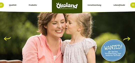
Certain colors have strong attributes about their impact on people. For example, green is meant to have a calmative effect on the recipient. In addition, it is used to brand environmental issues like Brightgreen Europe GmbH, organic cosmetics like LR, or organic food like Ökoland.
Another sphere of usage includes branding financial spaces, remember PSD Bank’s or BNP Paribas’s logos.
Strategically color is used to alter brand personality and purchase intent. Moreover, color influences the likability and familiarity of a brand. No wonder, companies use color when deciding on brand logos. If the color of the brand logo matches the personality of the goods or services, it is highly likely to lead a customer to purchase. Research shows that warm colors tend to attract spontaneous purchasers, while cooler colors can be more favorable among visitors but less converting. Bear this in mind when you choose the color scheme or button colors.
Let us figure out what are cool and warm colors. Warm colors are hues from red through yellow, browns and tans included. Cool colors are the hues from blue green through blue violet, most grays included.
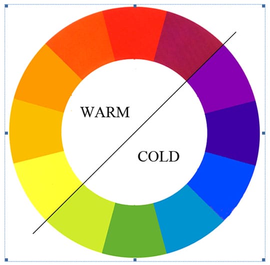
Warm colors are said to be visually active or psychologically arousing the viewer; meanwhile, cool colors have a calming and relaxing effect. Most of these effects are attributed to the higher saturation and the proportion of warm to cool pigments.
Gender aspect of color
Another thing to take into consideration is your target group. It is extremely important to use different color schemes depending on the gender of your customers.
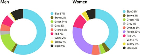
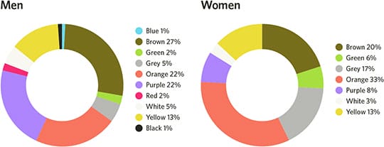
Definitely, environment, cultural perception, and personal experience play vital role in forming favorite colors for men and women. However, some researchers show that blue dominates in preferences of both genders, while there is clear liking for purple among women and dislike for it among men.
It would be a great solution to mind the least favorite colors for both groups too in order to avoid undesirable effects.
Here is an outcome you can consider in designing your site:
- Use warm colors creating calling to action elements (like buttons “Add to the cart”, “Sale”, “Subscribe” popups, etc.) or in headlines or logos. Usually, you can observe the dominance of red and orange in such elements, which proves to work out well for conversion.
- Use tints of purple and avoid brown and orange on sites for women. Use green and black (but not brown, orange and purple) on websites for men. And definitely, feel free using blue for male and female sites as both genders prefer them.
You may also like: Tricks & Tips to Make Your Design Soar Above & Beyond.
Color Design Examples
Here are some typical example of wise color choice for different sites that serve for better conversions.
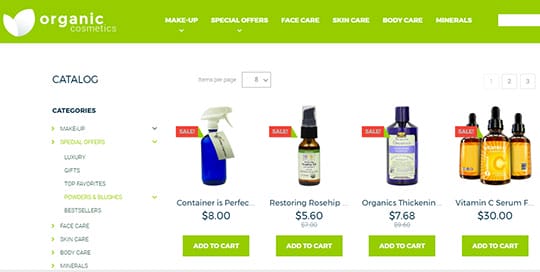
This Organic eCommerce Website Template will be particularly popular among women. Its tender green tints, soft and light color scheme and overall clean design with creative design elements meet expectations of the customer about Natural Health Products. It cleverly uses red buttons for sale offers, which immediately draws attention and evokes the desire to purchase the products.
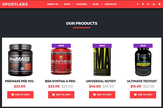
Another Ecommerce Website Template is sports related and aims at the male audience with energetic black and red combination. Vibrant red color is used to highlight the most important things: menu, price, and call to action button “add to cart”. Being a customer, you are bound to make a quick decision and buy the products on a whim.
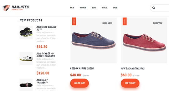
This minimalistic cross-gender Hamintec eCommerce Website Template uses the catchy logo, vivid typography and orange call to action elements and boasts the stuff but not the fluff. It will easily draw both male and female audience interested in sportswear.
Final Words
As you can see, color choice is essential in attracting customers and driving them to purchase. Definitely, color is a tricky thing, and you should use it in the right way, with the right audience, for the right purpose. Bearing in mind gender preferences, colors leading to action, and learning color theory might be extremely helpful. Use color wisely, and your site will feel more attractive, user-friendly and will help you boost sales!
This article is written by Allison Reed. Allison is a professional content strategist and an inspired author. Marketing manager by day and a writer by night, she is creating many articles on business, design, web development and SEO. She loves working with multiple CMS platforms and website builders like MotoCMS, and sharing her experience with the readers. Follow her: Facebook | Twitter.
 This article is written by Allison Reed. Allison is a professional content strategist and an inspired author. Marketing manager by day and a writer by night, she is creating many articles on business, design, web development and SEO. She loves working with multiple CMS platforms and website builders like


