Everyone debates about the benefits of “big data,” understood as the process of collecting massive amounts of data and its instant examination to find “hidden” information. Data, data, and lots of data, but the best data in the world is useless if people can’t understand them.
There are new professional roles such as the data analyst, who collects and analyzes data. But its purpose does not end there since it must then present its analysis to the end-users who will understand and going to work on that data. That’s where data visualization comes as a critical discipline that should need to take into consideration.
Most data analysts (or also called “data scientists”) and corporate workers are not necessarily graphic designers or data communication experts, so many times you can lose a lot of knowledge generated in the analysis when translating that data into graphs if those are not correctly formatted or arranged to allow for quick understanding.
Data Visualization and Presentation

As presentation designers specializing in data visualization, we find ourselves presenting more and more data visualization courses to analytics teams that have identified data visualization as an area of weakness. Usually, it is hoped that the visualization tool will solve the graph “automatically,” but we must think beyond the device and learn methodological clues that allow us to create useful visualizations.
There are many factors that influence the ability to visualize data effectively, ranging from the quality of the source data to its cleanliness. It is important to understand that the effectiveness of a data visualization does not only depend on the programming knowledge you have or the tool of design that you use but also knowing how to apply the principles of design and understanding how people process information when presented visually.
These are twelve essential tips that we should keep in mind when converting data into knowledge to make it easier for viewers to understand.
Recommended for you: The Importance of Color in Digital Marketing Data Visualization.
1. Always Keep Your Target Audience in Mind
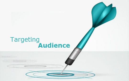
It is essential to customize any data visualization to meet the information needs of the audience. We must always keep our target audience in mind because at the end of they are the one who is going to use that data.
When visualizing your data, don’t lose sight of who the audience is, what their level of understanding about the topic is, what they want to learn from the data, etc. After finding answers to all these questions, you can focus on the next step: the formatting part.
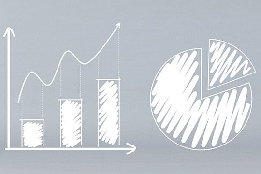
2. Choose the Right Graphic

Not all graphics work for everything; sometimes you need to follow something which does not actually belong to your niche. In other words, try to think out of the box. Each graphic is designed to show a type of information effectively, depending on what we want to do because your ultimate goal is to tell people what your data is about. You can choose from the standard flow charts, graphs, and tables, or you can explore infographics.
3. Highlight the Essential Information

When designing data visually, you must facilitate the reading by highlighting the critical information which you want to tell people. You can do this by using different colors, font size, text visuals, and pointers that emphasize and direct attention to the essential points of information.
4. Use Tables Sparingly

Avoid using lots of tables and charts. From my experience, tables should only be used when there is a need to show accurate values because otherwise, viewers tend to gloss over the information in tables.
You can instead use graphics to display relationships and patterns in the data, and trends and changing patterns of the information with the time variables. It entirely depends on you and your data to reduce the use of tables and increase the use of graphics where possible.
5. Eliminate Distractions and Highlight Your Focus Area

While making a presentation or presenting the data, always try to reduce the text, dark colors, images, etc. since these too many of these elements can easily become distracting. Try to keep it more explanatory and be straightforward with visualizations. When presenting the data and visualization, it is often helpful to use examples to further explain your point.
6. Provide Context to The Data

A good visualization is often accompanied by explanatory text. Tables and graphs on their own can present little meaning and value, so it is crucial to provide context so that it can be understood correctly. Try including small short descriptions that highlight key ideas and takeaways to draw from the data.
7. Use Color Intelligently

Colors are a powerful tool, and when representing data, they play an especially crucial role. Colors help to draw attention to the critical areas of the data. It also to group similar types of information together. Be mindful when selecting the color combinations since colors denote different meanings – for instance, red is often used to show negative and green for positive. You may also want to use your company’s brand colors when designing data visualization.
You may like: How to Get the Right Combination of Data Management Platform (DMP)?
8. Align the Data Graphs Correctly
![]()
When designing any data visualization, make sure to keep all elements in line with each other. Having even one misalignment can be a distraction to your audience when viewing your data. Take your time to ensure that all chart labels, titles, data points, etc. are in their correct positions.
9. The Title Provides Information

A great first impression is key to success. Same goes for the data presented. An excellent informative headline helps contextualize, focus, and attract the attention of the reader. A headline must indicate what information to expect from the data that follows.
10. Try to keep it simple. You are presenting results, not exploring data
Your aim is to inform people and give accurate results. Always try to make it more transparent and explanatory so that your audience can understand your conclusions better. Remember who is in your audience and the context of your presentation; what is the best way to make them understand your findings? Build your design based on your answer.
11. Interactivity Whenever You Can

You can facilitate the viewer’s understanding by adding interactivity when presenting the data or by sequencing when certain data appear on-screen if you are presenting live. In this way, you can explain your point to the audience step-by-step so they have a clear understanding before you move to present the next data set. Most data visualization tools also allow you to create a certain level of interactivity with the data.
12. The Form Follows the Function

While collecting the data always keep your goal in mind: what do you want to do with this data? Your choice of graph or other data visualization will depend on this. For example, to compare a category with smaller categories in which there is a relationship of each part with the global part, the ideal graph would be the stacked bar graph, since they show the percentage of each group’s total and are represented by the percentage of each value in the full amount.
13. Labeling

As Ljana Vimont, the Director of Stinson design, mentioned in his recent interview,
“Labeling plays a very crucial role while presenting data. Readers can easily interpret labeled data than text.”
Labeling with the help of various colors and types will help to assist the audience in grasping the information. Using colored arcs and chords to display transition data is the easiest way to highlight the essential points and identified with the corresponding data point.
Indicator: Indicators with incorporated colors are useful when you need to emphasize something with which is necessary.
Line Chart: Line charts are popular and the most common way to highlight the cases. They demonstrate an overall trend quickly and briefly, in a way that’s hard to misinterpret.
Pie Chart: Pie charts are useful in communicating straightaway with your target audience and inform them of the data by simply listing percentages that add up to 100%.
Pivot Table: Pivot tables are not such attractive and natural ways to visualize data. But, they are useful when you want to extract critical figures while seeing exact numbers and engage audience attention.
Funnel Chart/ Pyramids: Funnel charts and pyramids are a particular type of visualization that helps to depict the increasing and decreasing statistics of your business growth or sales.
14. Use Famous Templates

After collecting and analyzing data, the next and the most crucial step you need to follow is the presentation. It should follow a regular format to transfer that information and data. For example, if your goal is to present the changing behaviors of the people, write an introduction followed by the labeling, text, and conclusion. This allows users to see enough information without going into details. You can also add your creativity. But it will take some time for the audience to understand what actually going on.
You may also like: Visual Communication — Why You Need It for Your Brand?
The Bottom Line

If you follow these guidelines, you will increase the effectiveness of presentations and data visualizations. This allowing your audience to make more precise decisions about the data you have collected and presented.