Typography of a website is crucial because it can make a huge difference to the design. Good typography means your website is appealing, more readable and thus more likely to generate sales. As you pay attention to the quality of content, typography gains prominence because it accentuates designs, adds to the layout and keeps your audience engaged.
With web and design trends changing ever so often, typography trends are not to be left behind. They are important to complement the design and also make your website stand out. Some of the trends mentioned below have shown proven results and they are likely to be the major trends for 2014.
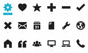
Iconic Fonts
The idea behind iconic fonts is elementary and it’s surprising that they weren’t as much a rage few years ago. They are ideal for simplicity and scalability, which are crucial factors with design. One of the advantages of these fonts is that they can be enlarged or reduced based on users’ requirements. Moreover they are becoming prominent because of the growing popularity of retina displays today. These vector based icons can be used in the form of fonts. As a result you can escalate them, add colors or apply additional effects on them like you’d do on regular fonts.
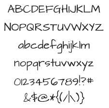
Handwritten Fonts
They can be used to give your website the personal touch that in some ways is missing in today’s digital world. These clean-lined handwritten fonts are gaining in popularity because people aim to socialize more and find an emotional connect with their audience. There is a wide variety of these fonts available to you today and it means you can easily give your content that personal touch. These fonts also ensure that your websites get that organic look, which is appealing in certain cases like those meant for children or crafts. This type of typography instantly spreads warmth but it can cause issues with readability.
Flat
Typography turned flat just as web standards went flat and responsive. There is a need for unified looks, which has had an impact of typography, with certain families like Helvetica and Arial being in spotlight. They have to get flat for two reasons; firstly to go with the website design and secondly to cut down the information reader needs to process. As the trends in web design evolve, so will those in typography.

Fixed Headers
Keeping these typography tips in mind is one thing, using them practically on your website is quite another. For example, a fixed header on your web page is important if you are a retailer, small business owner or a blogger for that matter. You have to realize that your readers would like to have things laid out for them neatly, especially if they are on an unfamiliar site. If you have a fixed header with smart and sharp typography, your name will definitely stay back with the user, who is more likely to build connect with it.

Pushing Limits with CSS3
CSS3 might not be the most cross-browser friendly option, but it certainly is making waves as far as rendering of websites in a browser is concerned. The idea behind it is to reduce the number of image calls while trying to be less dependent on resource heavy plug-ins. As a result you will not only be able to create content that is a lot more scalable you will make the right noises with search engines as well. It’s a strategy that has been employed by designers and developers who are going far and beyond with the simple code.

Mobile Friendly Typography
Numbers of mobile users is only going to grow in coming years with laptops making way for tablets and smart-phones. That’s the reason readable and iconic fonts are of great importance today since there’s much smaller space on mobile devices. While responsive design can take care of the design element for various devices, you still have to make sure that your content is readable to users, irrespective of the size of the screen they are on. Using the right font can make it possible, which is why it should be pondered over before sending out your design.

Large Type
Desktop screens are getting bigger; hence designers have more space to work around so that they can create readable and accessible websites. Text on the web has often been considered very small. But things are changing as from 800×600 resolution, we have come to the new age 720p and 1080p monitors. They bring in greater detail but also reduce font size.
While 8 pt font was considered to be standard in early 2000s, till recently 12-14 pt size was popular. But now that pixel size ratios have improved, you can’t take the liberty of using 12 pt size, more so because it affects the readability of your content. Much larger fonts, particularly in headlines and with specialized typography are being used by designers to draw the attention of users.

Conclusion:
If your objective is to create a simple, smart and functional website then you have to spare some thought to the typography you are going to use on it. For starters it has to be very clear and readable for different types of screen sizes that people use today. At the same time it has to be unique in a way that it adds to the style quotient and identity of your project.
This article is written by Ramya, a freelance web designer/writer based in India. She has an experience of about 8 years in content writing and have worked for top blogs and websites. She is generally an extrovert; she like photography, anthropology and travelling to different countries to learn the culture and living of the local inhabitants to do travelogues.


