Have you noticed how much of Facebook’s theme and branding is blue? Everything from the background to the app to text on its homepage tends to be a shade of blue. There are rumors that it is because Mark Zuckerberg is colorblind, which made blue the most vivid color he saw. However, multi-billion companies don’t make these kinds of choices haphazardly.
Color and Marketing
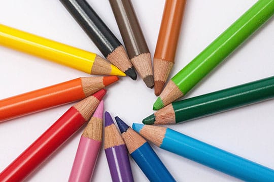
The truth is that humans are hardwired to process certain colors and images in a certain way, and it just so happens that blue has strong marketing value. One reason is that blue is not a distracting color, and can increase how long people stay on a web page. The psychology of color affects nearly every design decision you make, and there is solid science behind it, which is often reflected in a variety of marketing tools online.
To explore this further, let’s take a look at the science and role of color in marketing.
Recommended for you: 14 Ways to Improve Your Data Visualization and Presentation Skills.
A Primer on Color and Psychology
Colors influence psychology more than we like to admit. Color can affect our mood and encourage someone toward the mindset we want them to have. Color schemes are often proprietary, and they’re regularly associated with a group, product or cause. They’re also invaluable in marketing for this very reason. Let’s learn about how specific colors affect psychology and relate to other design decisions.
Red
 Red is associated with urgency. This is why red tags are popular for clearance sales as “red alert” is for urgent warnings. Red is also associated with appetite, explaining why nearly every restaurant logo incorporates it in some way. It can also be associated with passion, love, and lust, which is why it graces everything from Valentine’s Day presents to political messages intended to make you angry. Red is also associated with energy, excitement, and boldness, which is why it is common in brands aimed at children and teens.
Orange
 Orange is associated with a sense of caution, though it isn’t as severe as red in this regard. The color Orange is attention-getting. It can be used to attract impulse buyers as well as warn people away from safety hazards, yet it can also represent confidence and cheerfulness.
Blue
 Blue has been called “the nirvana of the brain” and is generally calming. It is associated with peace and tranquility and has long been associated with reliability and nobility. This is why blue is the most commonly used color in conservative brands seeking to appear trustworthy.
Blue creates a sense of security and encourages contemplation. It often curbs appetite, having the opposite effect of red. Blue tends to stimulate productivity as well, which is why blue is popular in operating system backgrounds.
Green
 Green is almost immediately associated with plants. This is why it is the first color tied to nature. The correlation is so strong that “green” is overwhelmingly associated with eco-friendly and environmental causes.
The color green is also associated with health, tranquility, and power, and tends to encourage balance and harmony. In the United States, green is also associated with wealth and finance, because it is the color of money.
Purple
 The color purple is associated with respect, which is why it is tied to both royalty and wisdom. This is also why it is often used to promote beauty products, especially anti-aging products. It can stimulate creativity and problem-solving.
Yellow
 The color yellow is a mixed bag. It can be seen as a cheerful color, lifting one’s mood as it is associated with sunlight, optimism, clarity, and energy. This is why it is sometimes called the happiest color and the color of the classic smiley face icon.
However, it can be a warning, too, which is why it is often used in traffic signs. Because it is so eye-catching, it dominates real estate signs. It stands out against a sea of brown, black and green natural scenery as well as beige buildings.
Black
 Black is often associated with authority, strength, power, and stability. This is why a black label is considered a hallmark of a premium product. However, it can be overwhelming if it is used too much, and it can be literally lost in the crowd if there aren’t other design elements to ensure someone sees it. This is why black labels or business cards tend to have white or gold text or flourishes.
Gray
 Gray is often seen as boring, drab and dull, yet it has its place in many designs. It is associated with practicality, neutrality, calmness, balance, and solidarity. However, it is also associated with old age. This is why you don’t want to use too much gray color in any design, even if the marketing materials are highly visible. You can offset a mostly grey logo with touches of black or white.
White
 White is associated with purity and cleanliness. It is often the default background color and the ultimate blank slate. The color white can also be associated with safety. White space with small dashes of color is associated with energy and creativity.
Brown
 Brown can be associated with the earth, making it a good choice for everything from gardening products to eco-friendly consumer goods. It may represent ruggedness, making it ideal for showing how rough, tough and strong something is. It can be inviting when associated with certain cultural icons. Brown turkeys and cornucopias in Thanksgiving decorations are a good example of this.
You may like: Look Out for These 7 Facebook Marketing Hacks for Your eCommerce Store.
The Relationship between Tone and Emotion
It isn’t enough to choose blue or yellow to evoke a particular emotional response; the tone matters, too. For example, brighter colors are more eye-catching, and it triggers a stronger reaction, too. This is why neon colors are key to standing out in a crowded boulevard.
Bright red gets people emotional, while dark red has a more subdued effect. Neon pink is a bright attention-getting feature if mixed with other colors, but gentle pink is calming. Softer tones can be calming in their own right. This is why light pink and baby blue shades are associated with babies.
The Role of Pure Colors

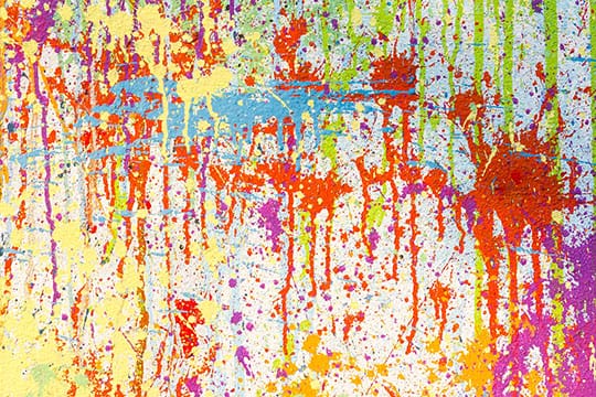
Colors can be defined as primary, secondary and tertiary. The primary colors are red, blue and yellow. The secondary colors are purple, orange and green. Tertiary colors are a mix of secondary colors and a primary color. For example, red-orange is a tertiary color, as is yellow-green.
Pure colors are often considered untainted and pure. This is why they are hallmarks of children’s toys and daycare decor. They’re also regularly used in summer clothes.
On the other end of the spectrum are tinted colors. These are pure colors with white added. Tinted colors can be called pastel colors. They aren’t as intense, and this lessens the emotions associated with that color. Black added to a color creates a shade. This can dull the emotion associated with the color or literally make it darker. For example, adding black to red creates crimson, a color associated with death instead of passion and life.
The Role of Contrast
Contrasting colors stand apart from each other. High contrast means they are easily separated from each other. The greatest contrast is black versus white. Low contrast colors may seem to blur into each other. Yellow next to yellow-green is an example of this.
Contrast is critical when you want the text to be visible to the casual reader, and it is necessary for readability. However, we too often assume that all bright colors have good contrast, though this isn’t true.
For example, orange and yellow are both bright, but they’re hard to separate from each other. And tone-on-tone color combinations are difficult to read, too, though they’re both popular and beautiful. Fortunately, there is a good way to judge the contrast in a neutral manner. You can judge the contrast of the colors by converting them to grayscale. If the two shades of gray in grayscale are close, the contrast is too similar if the text will be in one color or the other.
When you want to maximize readability, you can either have dark on light or light on dark. The text may not be as exciting if it was another bright color, but it is readable. If it doesn’t matter if someone reads the text, then the text isn’t really important.
You may also like: Using API (Application Programming Interface) in Affiliate Marketing.
Tips for Choosing the Right Color Scheme

You can choose from a rainbow of colors. However, if you want to successfully implement a branded color scheme, you should have just two to three colors.
Use these same colors on everything from your logo to your home page. You should embed them in your app and use them in your printed advertisements. You can use various marketing tools to integrate these colors into your web themes and test the consumer’s reaction to it.
Designers are typically emotionally mad in whatever they create, and that alters their perception of the designs they produce. You need to test the role of color in your marketing and branding. Because some studies show that up to ninety percent of snap judgments are influenced by color alone.
Always test the color scheme with both your current target demographic and the general market. What do they associate with the brand based on the colors you choose? You don’t want to use a color combination associated with a local sports team, national flag or other unrelated cultural phenomena. It also explains why you can’t just use the basic knowledge of color psychology to sell something. The combination may not be appropriate or reasonable for the product.
The solution is to choose colors that support the personality you want to portray in the brand and then test the color scheme with potential customers.
Color communicates emotions, and they can communicate much more in combination. Understand the basics of color psychology to minimize mistakes when creating designs, but know that there will be adjustments along the way if you want to convey exactly what you want the viewer to pick up.