In order to build a WordPress responsive theme using bootstrap, you need not know how to write code. All you need are basic skills like knowing how to access the WordPress dashboard and adding plugins or pages. Bootstrap is ideal for you if you are looking to build a responsive site that looks great on different screen sizes, especially on handheld mobile devices. Below we look at step by step WordPress theme development with bootstrap:
Preliminary Steps
There are some preliminary steps that you need to take before using bootstrap with WordPress. These are WordPress installation, downloading and unzipping Bootstrap files, and installation of the Theme Test Drive plugin. The plugin allows people to see a ‘coming soon’ or ‘website under construction’ page that they should access on your site, Only install it if you do not want users to see the website as you build it. After ensuring that you have taken all the preliminary steps, it is now time to begin adding bootstrap to WordPress:
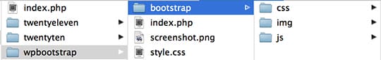
1. Accessing the bootstrap folder
Access the directory containing all the WordPress files.
- Go to wp-content
- Create a new folder. You can call it wpbootstrap
- Copy and paste the bootstrap folder into the folder you have just created
- Inside wpbootstrap (the newly created one) create index.php (a file)
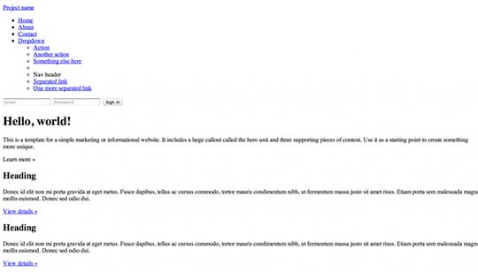
2. Creating a static HTML page
To create a static HTML page, you need to copy the source code from the site or web page you choose and Paste it into index.php
3. Creating the main CSS page:
In index.php, create a file and call it style.css (Do not name it otherwise. For the theme to work, WordPress requires it to be named style.css). It should be at the same level as index.php.
Add the following comment to the top of the style.css file:
WordPress uses this comment to access your theme’s meta information.
/*

Theme Name: WP Bootstrap
Theme URI: http://teamtreehouse.com/wordpress-bootstrap-theme-tutorial
Description: A demo theme built to accompany the Treehouse blog post <a href="http://teamtreehouse.com/wordpress-bootstrap-theme-tutorial">How to Build a WordPress Theme with Bootstrap</a>.
Author: Zac Gordon
Author URI: http://teamtreehouse.com/
Version: 1.0
Tags: responsive, white, bootstrap

License: Attribution-ShareAlike 3.0 Unported (CC BY-SA 3.0)
License URI: http://creativecommons.org/licenses/by-sa/3.0/

This simple theme was built using the example Bootstrap theme "Basic marketing site" found on the Bootstrap website http://twitter.github.com/bootstrap/examples/hero.html

*/
4. Image
You need to upload an image that will appear in the WordPress admin area. The image size should be 300 x 225 px. Name it screenshot.png (this is a WordPress requirement. Do not name it otherwise). Your file structure should be similar to:
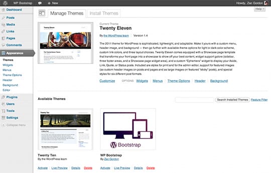
5. Activating the theme
- Access the admin area.
- Go to Appearance, then theme.
- You should see a new theme called wpbootstrap
- Activate it
See the image here:
This is how your site should look like this far:
6. Converting the static file into a functional WordPress Theme
- Create three files: header.php, sidebar.php and footer.php (Note that the naming is as it is here)
- Copy all the HTML at the top of pages into the header.php file.
Ensure that it looks like this:
<!DOCTYPE html>
<html lang="en">
<head>
  <meta charset="utf-8">
  <title>Bootstrap, from Twitter</title>
  <meta name="viewport" content="width=device-width, initial-scale=1.0">
  <meta name="description" content="">
  <meta name="author" content="">

  <!-- Le styles -->
  <link href="../assets/css/bootstrap.css" rel="stylesheet">
  <style type="text/css">
  body {
    padding-top: 60px;
    padding-bottom: 40px;
  }
  </style>
  <link href="../assets/css/bootstrap-responsive.css" rel="stylesheet">

  <!-- Le HTML5 shim, for IE6-8 support of HTML5 elements -->
  <!--[if lt IE 9]>
  <script src="http://html5shim.googlecode.com/svn/trunk/html5.js"></script>
  <![endif]-->

  <!-- Le fav and touch icons -->
  <link rel="shortcut icon" href="../assets/ico/favicon.ico">
  <link rel="apple-touch-icon-precomposed" sizes="144x144" href="../assets/ico/apple-touch-icon-144-precomposed.png">
  <link rel="apple-touch-icon-precomposed" sizes="114x114" href="../assets/ico/apple-touch-icon-114-precomposed.png">
  <link rel="apple-touch-icon-precomposed" sizes="72x72" href="../assets/ico/apple-touch-icon-72-precomposed.png">
  <link rel="apple-touch-icon-precomposed" href="../assets/ico/apple-touch-icon-57-precomposed.png">
</head>

<body>

  <div class="navbar navbar-inverse navbar-fixed-top">
   <div class="navbar-inner">
      <div class="container">
        <a class="btn btn-navbar" data-toggle="collapse" data-target=".nav-collapse">
          <span class="icon-bar"></span>
          <span class="icon-bar"></span>
          <span class="icon-bar"></span>
        </a>
        <a class="brand" href="#">Project name</a>
        <div class="nav-collapse collapse">
          <ul class="nav">
            <li class="active"><a href="#">Home</a></li>
            <li><a href="#about">About</a></li>
            <li><a href="#contact">Contact</a></li>
            <li class="dropdown">
              <a href="#" class="dropdown-toggle" data-toggle="dropdown">Dropdown <b class="caret"></b></a>
              <ul class="dropdown-menu">
                <li><a href="#">Action</a></li>
                <li><a href="#">Another action</a></li>
                <li><a href="#">Something else here</a></li>
                <li class="divider"></li>
                <li class="nav-header">Nav header</li>
                <li><a href="#">Separated link</a></li>
                <li><a href="#">One more separated link</a></li>
              </ul>
            </li>
          </ul>
          <form class="navbar-form pull-right">
            <input class="span2" type="text" placeholder="Email">
            <input class="span2" type="password" placeholder="Password">
            <button type="submit" class="btn">Sign in</button>
          </form>
        </div><!--/.nav-collapse -->
      </div>
    </div>
  </div>

  <div class="container">
Copy the HTML at the bottom of pages into the footer.php file. Ensure that it looks like this:
<hr>
<footer>
<p>© Company 2012</p>
</footer>
</div> <!-- /container -->
<!-- Le javascript ================================================== -->
<!-- Placed at the end of the document so the pages load faster -->
<script src="../assets/js/jquery.js"></script>
<script src="../assets/js/bootstrap-transition.js"></script>
<script src="../assets/js/bootstrap-alert.js"></script>
<script src="../assets/js/bootstrap-modal.js"></script>
<script src="../assets/js/bootstrap-dropdown.js"></script>
<script src="../assets/js/bootstrap-scrollspy.js"></script>
<script src="../assets/js/bootstrap-tab.js"></script>
<script src="../assets/js/bootstrap-tooltip.js"></script>
<script src="../assets/js/bootstrap-popover.js"></script>
<script src="../assets/js/bootstrap-button.js"></script>
<script src="../assets/js/bootstrap-collapse.js"></script>
<script src="../assets/js/bootstrap-carousel.js"></script>
<script src="../assets/js/bootstrap-typeahead.js"></script>
</body>
</html>Alternatively, you can and copy the paste into header.php and footer.php.
7. Adding the header and footer to index.php
We will use the get_header() and get_footer() tags. These two are built-in WordPress functions. They help to find the header and footer files and then add them to the top and bottom of the page.
When we create more pages, we will need to add the header and footer code on each page. If we need to change something in the header or footer, we can edit it at one place and the changes will reflect all across the pages.
8. Fixing the broken links to the CSS and Javascript files
To do this, we will begin from the header.
Change the code as described here:
<!-- Le styles -->
<link href="../assets/css/bootstrap.css" rel="stylesheet">
<style type="text/css">
body {
padding-top: 60px;
padding-bottom: 40px;
}
</style>
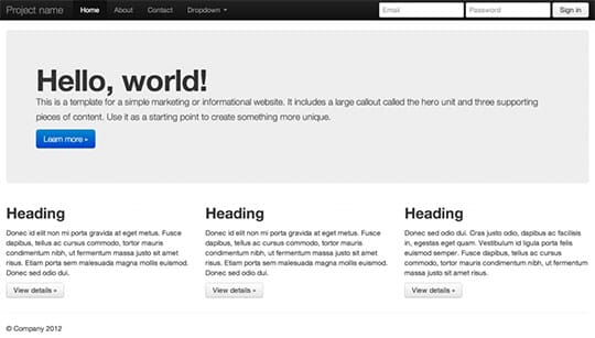
<link href="../assets/css/bootstrap-responsive.css" rel="stylesheet">From the same page, look for what to add into your style.css file.
Here, we have used the bloginfo() function that links to the theme’s bootstrap CSS files. We have also used the @import tag to aid in linking to bootstrap’s CSS files from the main style.css file.
This far, your site should look like this:
9. Adding the wp_head() function
This function helps in the addition of CSS or JavaScript to the site. This ensures that any plugins that we install work.
The header template should look like this:
<head>
  <meta charset="utf-8">
  <title>Bootstrap, from Twitter</title>
  <meta name="viewport" content="width=device-width, initial-scale=1.0">

  <!-- Le styles -->
  <link href="<?php bloginfo('stylesheet_url');?>" rel="stylesheet">

  <!-- Le HTML5 shim, for IE6-8 support of HTML5 elements -->
  <!--[if lt IE 9]>
  <script src="http://html5shim.googlecode.com/svn/trunk/html5.js"></script>
  <![endif]-->

  <?php wp_enqueue_script("jquery"); ?>
  <?php wp_head(); ?>
</head>
<body>

  <div class="navbar navbar-inverse navbar-fixed-top">
    <div class="navbar-inner">
      <div class="container">
        <a class="btn btn-navbar" data-toggle="collapse" data-target=".nav-collapse">
          <span class="icon-bar"></span>
          <span class="icon-bar"></span>
          <span class="icon-bar"></span>
        </a>
        <a class="brand" href="<?php echo site_url(); ?>"><?php bloginfo('name'); ?></a>
        <div class="nav-collapse collapse">
          <ul class="nav">

            <?php wp_list_pages(array('title_li' => '', 'exclude' => 4)); ?>

          </ul>
        </div><!--/.nav-collapse -->
      </div>
    </div>
  </div>

  <div class="container">
10. Fixing footer problems
We need to delete links to JavaScript files that we will not be using on the site. This is how the footer.php file code should be:
    <hr>
    <footer>
      <p>0 Company 2012</p>
    </footer>
  </div> <!-- /container -->

  <!-- Le javascript============================== -->
  <script src."../assets/js/jquery.js"></script>
  <script src."../assets/js/bootstrap.js"></script>
</body>
</html>
11. Adding the wp_footer() tag
This is placed in just before the closing body tag. It should look like this:
    <hr>
    <footer>
      <p>© Company 2012</p>
   </footer>

  </div> <!-- /container -->

  <?php wp_footer(); ?>

</body>
</html>
12. Loading a JavaScript file
Using the wp_enqueue_script() function, load jQuery near wp_head().
Add this code to the header.php file:
<?php wp_enqueue_script('query"); ?>
<?php wp_head(); ?>
Create a functions.php file.
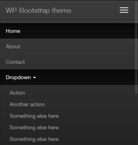
Check whether your drop down menu looks like this:
13. Creating a WordPress homepage
- Access the admin area.
- Click pages, then add new.
- The page should be titled home.
- Click on the HTML tab (above the content editor).
- Cut the remaining markup from index.php.
- Paste it into the home page and publish.
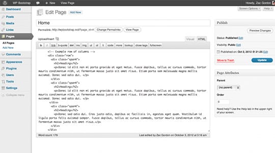
This is how the home page should look:
The only things that should be left in the index.php are the header and footer.
14. The Loop function
You need to include the content that you have created in the admin area in the template. This function is able to loop through a page or post and pull information like the title, date of publishing, author, and comments. It also pulls the content.
Here is the code for the loop function:
<?php if ( have_posts() ) : while ( have_posts() ) : the_post(); ?>
<?php endwhile; else: ?>
<p><?php _e('Sorry, no posts matched your criteria.'); ?></p>
<?php endif; ?>
Also, check how index.php looks like after using the loop function.
<?php get_header(); ?>
<?php if ( have_posts() ) : while ( have_posts() ) : the_post(); ?>
<?php endwhile; else: ?>
<p><?php _e('Sorry, no posts matched your criteria.'); ?></p>
<?php endif; ?>
<?php get_footer(); ?>
We then need to add the code that will pull the page title and content. The code we will add is the_title() and the_content().
- Go to Settings in the admin area, then reading.
- Under ‘front page displays’ choose ‘static page’ as opposed to blog posts.
- Select ‘home’ from the homepage.
- This will ensure that a static page is displayed instead of blog posts on the homepage.
15. Adding Content and Navigation
In the admin area, add more pages: about us, blog, contacts or even news.
Find the unordered list with the class ‘nav’ and delete all the list items to replace the static navigation menu with one that displays the pages that we have published.
16. Adding Widgets:
Adding widgets allows us to use them in the sidebar.
To do this add the below code in function.php
<?php
function wpbootstrap_scripts_with_jquery()
{
  // Register the script like this for a theme:
  wp_register_script( 'custom-script', get_template_directory_uri() . '/bootstrap/js/bootstrap.js', array( 'jquery' ) );
  // For either a plugin or a theme, you can then enqueue the script:
  wp_enqueue_script( 'custom-script' );
}
add_action( 'wp_enqueue_scripts', 'wpbootstrap_scripts_with_jquery' );

if ( function_exists('register_sidebar') )
  register_sidebar(array(
    'before_widget' => '',
    'after_widget' => '',
    'before_title' => '<h3>',
    'after_title' => '</h3>',
  ));
?>
Conclusion:
All in All, The above steps show you how to use bootstrap with WordPress. As you see, it’s not as complex as it may seem. When you follow the steps, you are on your way to building a WordPress responsive theme using bootstrap, even with no coding knowledge.
This article is written by Ashish P. As a Senior Marketing Manager, Ashish directs media relations, branding, advertising and website development. With the completion of several marketing projects for different companies, he also holds a firm experience in designing effective digital marketing strategy for the company. He is a web development and business development expert with the experience of 7+ years. Follow him: Website | Facebook | LinkedIn.


