At the end of the day, the word “Conversion Rate”, I believe, is the ultimate criteria for any website owners. So improving it and maintaining a steady growth is always a must-to-do task for improving the revenue stream of your business. Well, in that case, the improvement and enrichment of the user experience of your website have an enormous and direct impact on your website conversion rate. A perfect design can do a miracle for your site to convert.
Here I am discussing ten very essential elements that a modern website should include in their design to make the site attractive, user-friendly and easily rememberable. These not only help to enhance the user experience of your site but also improve the conversion rate on a massive extent.
1) Flat or Semi-Flat Design:
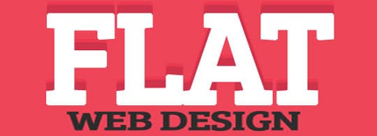
The word flat design means where a minimum amount of stylistic elements used for giving the feel of the illusion of three dimensions. Along with that they also try to use the lowest amount of simple elements, flat colors, and typography in their design. This flat design used while creating drop shadows, gradients, or textures.
Examples: To get an idea about flat design, you can visit the website of MailChimp. MailChimp is a very renowned platform for email marketing. The site like Squarespace, the famous website building platform, is another great example of flat design.
2) Background Video and Hero Images:
The concept of video background is quite simple. You need to add a video on your website that will run in the background. Similarly, a hero image is a large photo that you can place in the background of your site. Both need to be responsive to fit properly on all kind of screen size.
Examples: Just visit the website of the Life of Pi movie. This is an excellent example of video background. And for hero image, check the large background image of InVision.
3) Large Call-to-Action Button:

Call-to-action button or CTA buttons are mainly the large, eye-catching responsive clickable buttons, which helps to grab the attention of visitors towards your product or service. The text button should be large enough, and it should be easily readable by your visitors. However, it should not be so large that it looks unpleasant for your eyes.
Examples: Almost all leading websites are now using CTA buttons on their site. Evernote and the Tinker Law Firm are the perfect examples of websites who have incorporated the CTA buttons quite well. Visit each website either from your desktop or your mobile devices. In each case, you can find their CTA buttons above the fold.
4) Unique Typography with Large Fonts:
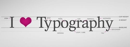
As per current design trends of 2016-2017, the unique typography with large fonts is needed to be considered by every designer while making any website. It gives a unique designing looks along with properly portray vision and pleasant feeling for the visitors. It helps a site rememberable by its visual impact.
Example: Check the perfect example of bold and unique typography, the website of the New Yorker.
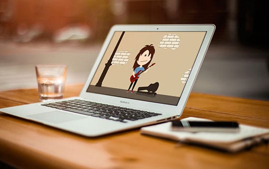
5) Animated Explainer Video and Product Video:

Right now, videos are creating a huge impact on every generation. In this scenario, creating a product video or animated explainer video about your product can be an essential option to consider. Well, through a well-crafted video you can showcase your products and can explain your customers about the importance of your products. Make sure the video need to be interesting, short and explain every aspect of your product or service.
Examples: The Salesforce Sales Cloud product video and the Amazon EC2 whiteboard explainer video can give you a clear idea how to promote your product by creating a good video.
6) Large Product Image:
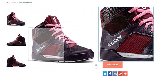
Larger product image means the capacity of watching your product in a bigger and fuller way. It should have the potentiality of high definition. As a result, viewers can get the chance to explore the product very closely. Good and clear images have the massive impact on the conversion rate.
Examples: Check the large high definition images used on the product page of Samsung Galaxy S7 and HTC Vive.
7) Bold Color Theme:
![]()
A good and bright color scheme can do a lot of positive work for your website. One significant help is that it can instantly make the mood of your visitors happy and pleasant. A good color combination has the quality of mood enhancement. A pleasant, bold background color can make your website more vibrant and lively for your visitors. Moreover, as a result, it can help your visitors to stay for a longer time into your site. And as longer they remain on your website; the chance of conversion will also go to the higher side.
Example: Visit the newly modified website of Snapdeal and check how they have used a vibrant and attractive pink color with the combination of white.
8) Flat Icons:
Flat icons look quite dynamic and professional especially when you use it with a flat design. These icons are of many style and forms; need to choose according to your requirements and necessity. Flat icons look quite simple, but at the same time, quite understandable for the viewers.
Example: Currently, flat icons are everywhere. Almost all newly designed websites are using flat icons. Still, for example, you can watch out for the flat icons on the home page of UpWork.
9) Hamburger Menu:
The designers use this hamburger menu which is also known as a menu with hamburger icon. All modern mobile friendly website design includes this type of menu. This particular menu helps the mobile viewers to find out the navigation of a website quite easily. According to several recent studies sites with hamburger menu converting more occasionally than a traditional menu. So, it is better to give it a try.
Examples: Open Youtube or Mashable on your mobile browser. You can find the perfect examples of hamburger menu.
10) Retina Ready:
Retina Display is the term introduced by Apple to refer a gadget which has a screen with a very high pixel density. As a result, retina display product more sharpness in images. So, the images you are using on your website need to be extra sharp to display on those devices without losing the quality. If your site is retina ready, there is a good chance to convert those visitors who will visit your site by using a device having a retina display.
Example: Here I am providing the demo link of Avada. This is a retina ready WordPress theme. This is also the highest selling WordPress theme of all time.
Final Words:
 The above ten modern elements of web design, if implemented correctly, can do a miracle in increasing the conversion rate of your website. Go ahead and try them on your site. And I am sure; it is going to make a huge difference in a positive way.