Designing a logo can cause you a lot of trouble, especially if you want it to look well-balanced and comprehensive. One of the most significant elements that almost every logo has is the typography that expresses some accurate information about the company the clients should be aware of. Therefore, typography deserves lots of attention while thinking about the future logo.
Undeniably, as a brand’s visual identity having a well-designed logo is the foremost requirement for every business. It consists of colors, shapes, fonts, and many other design elements to make it alluring. Proper use of these elements gives your brand a creative and unique identity which makes you outshine the competitors.
Among these many design elements, one thing that designers are always worried about is selecting the best logo design fonts for the business. There are thousands of typefaces available on the internet, and among those fonts which give an appealing look, it is hard to decide.
What affiliations will they bring to the abstract style? What speculations will they make about your image character subject to it? To address these solicitations and that is only a trace of something bigger, we’ve amassed these tips and rules to assist you with picking a Custom logo content style that is clearly for you. Investigate to discover the typefaces that work best for your image.
Being the most significant factor of the whole custom logo design, a single mistake in selecting it can break your design. So, you must identify one or two best fonts that look perfect in your logo design and hold the professionalism of the brand. So, let’s discuss some of the best logo design fonts that you can use in your logo and make it attractive.
1. Aabel
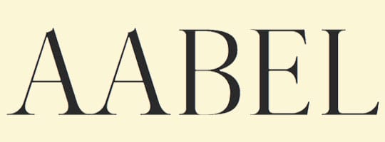
Aabel comes under the category of serif typefaces. This modern font looks aesthetic in your logo design and is specifically suitable for luxury and fashion brands.
Actually, it comes with the three weights: regular, bold, and light. All these versions look beautiful in the uppercase and lowercase letters. Not only in the business logo design, this font suits posters, headings, advertisements, packaging design, books, and many more places. Any font combination with this looks great in your logo, therefore, it won’t be a wrong choice to use this.
2. Garamond
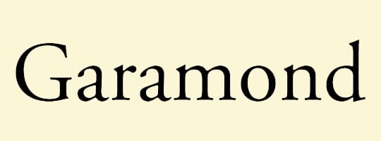
Garamond is one of the oldest serif typeface designs coming from the 16th century. Take the best advantage of this font by adding in your custom logo design, it gives an elegant look. Showcase your brand’s personality and professionalism with this typeface by using it in a logo.
It was originally inspired by Claude Garamond’s punch cuts; currently, you can get many variations of this particular font. The most popular is Adobe Garamond which was designed by Robert Slimbach. Due to its readability, it’s used in the magazine and newspapers as well.
3. Rockwell
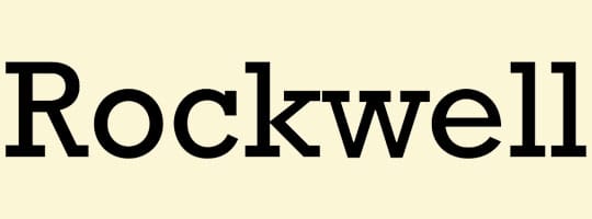
Another best logo font which makes your design even more eye-catching. It comes under the slab serif font family. Although it was designed in 1934, it comes in the limelight currently and can be used in the business logo design.
It was used in the informational signage at Expo 86, Docklands Light Railway used the bold weight of the Rockwell in the 1980s. Due to its mono-weighted stroke, it’s primarily used in the small size.
4. Frutiger
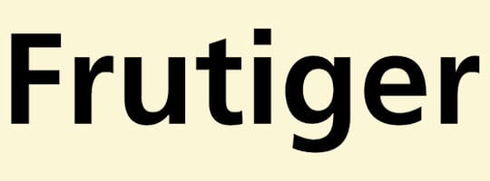
A font with better legibility even in the small size. So, you don’t need to worry if your logo design is used in any size of the screen or place. It was designed by Adrin Frutiger, a designer of the Univers font. As the designer is from the Swiss, it has been used in the Swiss passport since 1985.
In planning the typeface’s ancestors Concorde and Roissy, Frutiger’s objective had been to make a sans-serif typeface with the discernment and tidiness of Univers however the natural and relative parts of Gill Sans.
Therefore, to give your logo great readability in a small and large application this font would be the best choice.
5. Times New Roman

The widely used font across the world, and hardly find anyone who is unaware of this typeface. Times New Roman is one of the most popular fonts from the serif typefaces. It was first commissioned by the British newspaper. The popularity of this font has increased rapidly from designing it to becoming famous for magazine, newspaper, and book printing.
Due to its clean and modern appearance makes your logo even more elegant, the legibility of this font encourages designers to use it again and again. Moreover, the bold and italic version of it was inspired by the Didot family. With this many benefits of this font, it is never going to be the wrong choice to opt for Times New Roman in the logo, it surely captures the attention of the people.
6. Futura
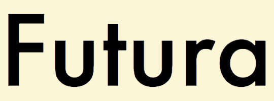
It’s a geometric sans-serif typeface which means it’s based on geometric shapes such as circles, triangles, squares, and many more. It was designed by Paul Ranner in 1927 and then it became a very popular typeface for designing a logo. Famous companies namely FedEx and Swissair have already used this in their business logo design.
Futura was a contribution to the Frankfurt project, an affordable housing project in Germany. Along with the clear geometric appearance, it also gives the feel of the classic typefaces. It never includes the more decorative elements, a purely geometric approach makes it more appealing when used in the logo.
7. Canilari
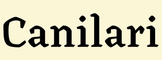
Canilari can be looked at as a somewhat outcast typeface. It’s inspired by the contemporary serif typefaces. It has its own style and by using it in your logo, you can make it out from the crowd.
The family comprises 2 sets: one norm and one genius, each in 4 loads in addition to italics. Canilari likewise incorporates a lot of trimmings and enlightened tops, motivated by the indigenous specialty of the pre-Columbian people groups of the Americas.
The thick cuts in the typeface can be a choice for modern butcher shops. And this thick cut can be used in the headings to highlight it from the other texts.
8. Trajan

Trajan comes under the serif typeface family which was designed by Carol Twombly in 1989. This font is based on the Roman square capitals. As it’s inspired by the artist, it can be the best choice to showcase the past in the logo.
“The design is based on the letterforms of capitalis monumentalis or Roman square capitals, as used for the inscription at the base of Trajan’s Column from which the typeface takes its name. Trajan is an all-capitals typeface, as the Romans did not use lower-case letters. Twombly created the design taking inspiration from a full-size picture of a rubbing of the inscription. It is well known for appearing on many film posters. Ironically, the typeface is inadequate for typesetting Latin.”
Wikipedia
9. Didot
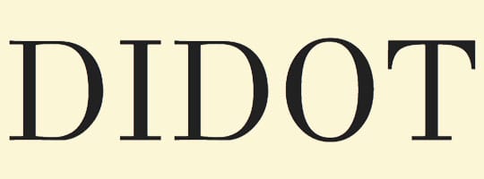
This typeface is named after the French printing and type-producing family. One of the versions of Didot is used in the Giorgio Armani logo.
There have been several revivals of The Linotype Didot Font Family, particularly with the development of hot metal type and Linotype’s more recent redesign to adapt the font for digital use.
If you’re a fan of using contrast color then this font will be the best choice. With the clever use of colors, it becomes even more attractive. Therefore, fashion brands will choose this font more often for their logo design.
10. Bodoni
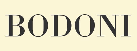
This could be the best option for you to include the thick and thin line in the logo. It can be used in headlines, logos, decorative texts, or to highlight any text among many others. Following the logo design trends for attracting people can be possible with this font.
At the point when initially discharged, Bodoni and others did one text style called traditional plans in view of their sane structure. In any case, these text styles were not refreshed adaptations of Roman or Renaissance letter styles, yet new structures. They came to be called ‘current’ serif text styles; since the mid-twentieth century, they are otherwise called Didone plans.
Popular companies like Vogue and Calvin Klein have used this typeface in their business logo design and they are able to grab the attention of many people.
11. Bauru
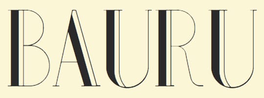
If you need your logo to look sophisticated, determined, and fashionable, take a look at Bauru. Designed by Pier Paolo, it is available for both personal and commercial usage. With the help of a marvelous mixture of thin and bold lines, the font leaves a hint of volume and coherence at the same time. It is luxurious, especially if you add some silver or golden lines to its general expression.
12. Chocolate Box
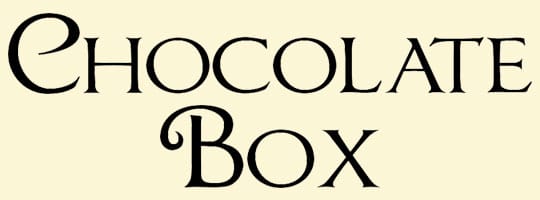
The font is unique indeed. It is distinguished from the rest of Roman letterforms for being sweet and delicious. Every letter reminds you of chocolate candy in the box for being unique and awakening your appetite for impressive designs. This font includes 87 original characters that will look remarkable not only on candy boxes but also on those companies’ logos that want to show how refined and noteworthy they are.
13. Voga
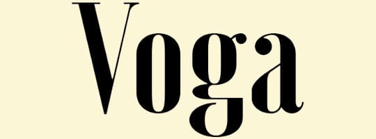
Simply stylish is Voga’s motto. Sticking to it, Voga looks brilliant on logos because of its integrity and simplicity. Created by Charles Daoud, the font is perfect for your brand’s endorsement. The reason for this is hidden in the font’s creator, who is known for being truly passionate about making brands look original and appealing to their customers. If you need something to impress your clients with, Voga will be a perfect choice.
14. Bardo
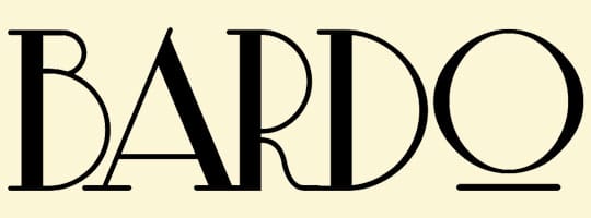
New fonts appear every day, which is why it is really hard to notice a real gem in a pile of semi-jewels. Bardo is exactly this kind of gem that was designed in March 2017. It’s classic and yet fashionable, that’s why you should take it into account while thinking of a logo for your new company. Bardo is a guarantee of your uniqueness, for lots of people simply don’t know this font has appeared on stage. Experimenting with colors will only add a sparkle of a miracle to your future logo.
15. Fields of Cathay
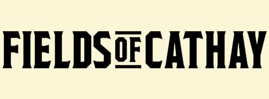
Another new and, what’s highly beneficial, a free font that was presented to the audience at the end of March. This font is worth your admiration if you’re looking for something compelling and convincing. It reminds you of some old Western movies that used to captivate their fans. The function of captivating its clients has been transferred to this font as well; therefore it will be soon recognized by thousands of people. Make sure your logo will be one of the first in the world that was bold enough to use Fields of Cathay for incorporating your company’s name in it.
16. Zviro
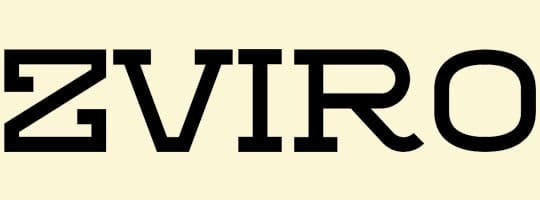
Its official representation picture includes 5 stars and is a significant hint for its future clients: the original idea implemented by Zviro deserves not less than 5 stars for being turned into life. Zviro is large and massive and is excellent for those logos that want to look extraordinary as well. Smooth and sharp lines combined with one font leave an impression of being authentic and fresh. Nothing more is needed for a successful representation of your company.
17. Oduda
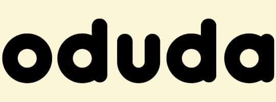
Bold, round, splashy, and unusual: everything this font has is aimed at getting remembered. Designed by Thom Niessink, it looks amazing in any color palette. Therefore, if your target audience includes young people who are daring and aren’t afraid of taking some risks, Oduda will thrill them for sure. Your brand’s logo should recall your clients’ wishes; Oduda makes sure this aim is reached.
18. Uni Neue
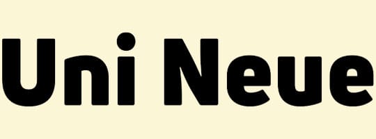
Principles of geometry have never failed designers, for Geometry was called a queen of design studies. Without geometrical proportions that include symmetry, design cannot be called breathtaking. Uni Neue is one more example of this rule. Designed symmetrical, it corresponds with the basic geometrical laws and thus looks charming. Designed by Plamen Motev and Svet Simov, the font will fit those logos that have lots of space or are conceived in a minimalistic style: it will bring a gleam of seriousness and strength.
19. One Day Font

The One-day fly lives only 24 hours. In this period of time, it gets born, goes through all the life stages, and dies. One Day font was called not after these small insects, for the logos that use this font live certainly more than one day and are capable of bringing joy into people’s lives. Its designer, Nawras Moneer, spent only 24 hours for the font’s creation. This fact speaks for the enormous talent of Moneer because the font is really genius. Following the latest trend in typography, and broken letters, One Day will never be dull: it looks competitive, imaginative, and creative. If you want your logo to have these qualities, try out One Day, and you will never regret it.
20. Athene
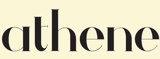
This serif typeface is completely free for commercial usage and can impress you with its clearness and naturalness. Its round shape looks compelling and can be beneficial for those who thrive on volume and recognition. What’s more important, the typeface includes a wide range of symbols that can be used for a logo design.
Wrapping up
This was a complete guide to choosing the right font for your logo design. If you are in a dilemma in making the right choice. The primary reason a Graphic design is essential to any business organization is that it acts as a face to the company. The logo design will communicate almost everything about an organization. It tells viewers what type of audience you are targeting, what is the mission of your company, and what kind of products are you selling. Hence, it is necessary to craft logo design simply and attractively.
The selection of the proper font for your brand’s logo can’t be overlooked. It has remarkable significance to make your design alluring. Now we have a wide variety of fonts, so you must identify the proper font that suits your design. The above-mentioned fonts are frequently used by the designers and each has a different application where it fits, so based on the need you can opt for. To design an eye-catching logo for your company you must understand the importance of color and fonts. The above-mentioned helps you to know how you can utilize colors and fonts to craft an engaging logo.