Quick Summary
The success of a video often depends on whether viewers click on it first, making YouTube thumbnails more important than ever in 2026. A well-designed thumbnail serves as a visual first impression that instantly communicates value, improves click-through rates, and builds trust when it accurately reflects the video’s content.
By combining clear visuals, strong contrast, concise text, and consistent branding, creators can stand out on an increasingly competitive platform while avoiding common mistakes such as cluttered designs and misleading clickbait.
The article also explores how psychology, AI-powered design tools, and data-driven testing are shaping modern thumbnail creation. While AI can streamline tasks such as image enhancement, background removal, and layout suggestions, human creativity remains essential for understanding audience expectations and maintaining authenticity.
Ultimately, creators who prioritize clarity, mobile-friendly design, continuous A/B testing, and honest visual storytelling will be better positioned to attract viewers, improve engagement, and achieve sustainable channel growth.
Introduction
Every minute, hundreds of hours of video are uploaded to YouTube. For creators, businesses, educators, and marketers, this means one thing: getting noticed has become increasingly difficult. While producing high-quality content remains essential, even the best videos can go unseen if viewers never click on them.
This is where thumbnails play a crucial role.
A thumbnail is often the first impression viewers have of a video. It functions like a digital billboard, encouraging people to stop scrolling and pay attention. Although titles, descriptions, and recommendations influence discoverability, thumbnails frequently determine whether someone clicks or continues browsing.
As content competition continues to grow in 2026, understanding thumbnail design has become an important skill for anyone publishing videos online. This article explores why thumbnails matter, the psychology behind effective designs, common mistakes to avoid, and how artificial intelligence is changing the way creators approach thumbnail creation.
The Role of a Thumbnail in Video Performance
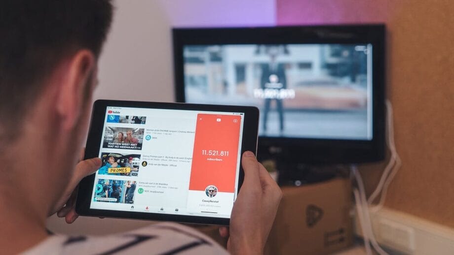
A thumbnail is much more than a decorative image. It communicates information before the video even begins.
When users browse search results or recommendations, they make split-second decisions based on visual cues. In many cases, viewers spend only a brief moment evaluating whether a video appears relevant or interesting enough to watch.
An effective thumbnail helps answer several questions immediately:
- What is this video about?
- Is it worth my time?
- Does it look trustworthy?
- Will it solve a problem or entertain me?
These decisions happen almost instantly, making thumbnail design one of the most influential factors in attracting initial clicks.
Understanding Click-Through Rate
One of the most commonly discussed metrics among YouTube creators is Click-Through Rate (CTR).
CTR measures how often viewers click on a video after seeing its thumbnail and title. While a higher CTR does not automatically guarantee success, it generally indicates that the video’s packaging is attracting attention.
However, increasing CTR should never come at the expense of viewer satisfaction. If a thumbnail creates unrealistic expectations, viewers may leave quickly, resulting in lower watch time and reduced engagement.
The most successful creators focus on matching the thumbnail to the video’s actual content.
What Makes a Thumbnail Effective?
Although design styles vary between niches, successful thumbnails often share several characteristics.
Clear Subject Focus
Every thumbnail should have one primary subject. Whether it is a person, product, object, or graphic, viewers should immediately understand what deserves attention.
Cluttered visuals compete for attention and reduce clarity.
Strong Visual Contrast
Contrast improves visibility across different devices, especially smartphones.
Using distinct colors between the foreground and background helps important elements stand out without overwhelming the viewer.
Readable Text
Text should support the visual rather than replace it.
If text is included, it should be:
- Short.
- Large enough to read on mobile devices.
- Easy to understand within seconds.
Many successful thumbnails use only two to five words.
Emotional Connection
Human faces continue to attract attention because people naturally respond to expressions.
Surprise, excitement, curiosity, confidence, or concern can all encourage viewers to learn more, provided the expression matches the video’s actual message.
Consistency
Creators who maintain a recognizable visual style often build stronger audience recognition over time.
Consistent fonts, colors, layouts, or branding elements help returning viewers identify content more quickly.
Common Thumbnail Mistakes
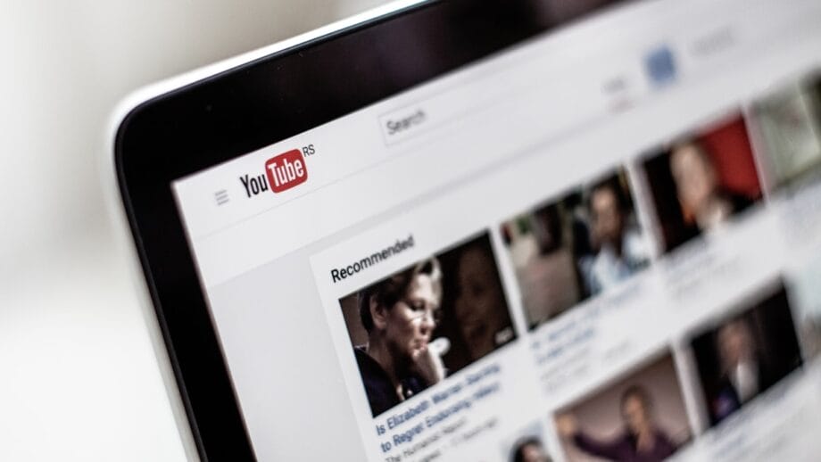
Despite having access to better editing tools than ever before, many creators still make avoidable design errors.
Too Much Text
Trying to summarize an entire video inside the thumbnail often creates visual clutter.
Instead, use the title to provide details and let the thumbnail spark curiosity.
Misleading Visuals
Clickbait may increase clicks temporarily, but disappointed viewers rarely become loyal subscribers.
Building long-term trust is far more valuable than chasing short-term metrics.
Low Image Quality
Blurry images, pixelated screenshots, or poorly cropped visuals create an unprofessional impression.
High-resolution images remain essential even though thumbnails appear small.
Poor Color Choices
Low contrast makes important elements disappear, especially on mobile devices.
Bright does not necessarily mean effective. Color combinations should improve readability rather than distract viewers.
Overcomplicated Layouts
Adding too many arrows, circles, icons, emojis, and graphics can overwhelm viewers.
Simple designs often communicate ideas more effectively.
The Psychology Behind Thumbnail Design
Thumbnail performance is closely connected to human psychology.
People naturally notice:
- Faces
- Bright colors
- High contrast
- Unexpected situations
- Clear visual hierarchy
Curiosity also plays an important role.
A successful thumbnail often provides enough information to generate interest without revealing everything.
For example, showing an unusual result instead of explaining every detail encourages viewers to watch the video to understand what happened.
How Artificial Intelligence is Changing Thumbnail Creation
Artificial intelligence has significantly transformed creative workflows over the past few years.
Instead of starting from a blank canvas, creators can now receive suggestions for layouts, backgrounds, text placement, color combinations, and image enhancements.
AI is not replacing creativity.
Instead, it is helping creators spend less time on repetitive editing tasks and more time refining ideas.
Some AI-powered tools can assist with:
- Background removal
- Image enhancement
- Automatic resizing
- Color optimization
- Text generation
- Design recommendations
- Subject isolation
These capabilities make professional-looking thumbnails more accessible to creators who may not have formal graphic design experience.
Human Creativity Still Matters
Despite rapid improvements in AI technology, creative judgment remains essential.
Artificial intelligence can recommend layouts or improve image quality, but it cannot fully understand audience expectations, storytelling goals, or brand personality.
Successful creators continue making important decisions such as:
- Choosing the right message
- Understanding audience interests
- Maintaining visual consistency
- Testing different concepts
- Aligning thumbnails with video content
AI works best when supporting human creativity rather than replacing it.
Why A/B Testing Matters
Even experienced creators cannot predict which thumbnail will perform best every time.
Testing multiple versions allows creators to learn which visual elements resonate most with their audience.
Variables commonly tested include:
- Different facial expressions
- Background colors
- Text variations
- Object placement
- Zoom levels
- Lighting adjustments
Small design changes sometimes produce meaningful improvements in viewer engagement.
Over time, these insights help creators develop a stronger understanding of what works for their specific audience.
Mobile-First Thumbnail Design
A significant portion of YouTube viewing now happens on smartphones.
This means thumbnails should be designed primarily for smaller screens.
Before publishing, creators should reduce the image size and ask:
- Can the subject still be identified?
- Is the text readable?
- Does the image remain visually clear?
- Are unnecessary details distracting?
Designs that work well on desktop but become unreadable on mobile often underperform.
Branding Without Overbranding
Brand recognition is valuable, but excessive branding can reduce thumbnail effectiveness.
Large logos often occupy valuable visual space without increasing clicks.
Instead, subtle consistency through colors, typography, and layout usually creates stronger long-term recognition.
For example, some creators use identical border styles or recurring color palettes across all their thumbnails.
These small visual cues help viewers recognize content naturally.
Accessibility Considerations
Inclusive design improves the experience for everyone.
Creators should consider:
- High color contrast
- Readable typography
- Simple layouts
- Minimal visual clutter
These improvements benefit viewers across different devices and viewing conditions.
Accessibility is not only good design practice but also improves usability for a wider audience.
Measuring Thumbnail Success
Rather than judging success based on impressions alone, creators should evaluate multiple performance indicators.
Useful metrics include:
- Click-Through Rate
- Average View Duration
- Audience Retention
- Watch Time
- Viewer Satisfaction
- Returning Viewers
Looking at these metrics together provides a more complete understanding of thumbnail performance.
A thumbnail that generates many clicks but poor retention may need improvement.
Choosing the Right Workflow
Different creators have different needs.
Some prefer designing thumbnails entirely from scratch using graphic design software.
Others combine manual editing with AI-assisted features to reduce repetitive work while maintaining creative control.
For example, some creators experiment with platforms such as ytzolo to accelerate parts of their workflow while still making the final creative decisions themselves.
Ultimately, the best workflow is the one that balances efficiency, consistency, and originality.
Looking Ahead
Thumbnail design will continue evolving as AI capabilities improve and viewer expectations change.
However, one principle is unlikely to change: successful thumbnails communicate value quickly and honestly.
Creators who focus on clarity, authenticity, and continuous improvement will remain better positioned to compete in an increasingly crowded content landscape.
Rather than chasing trends or relying solely on automation, the most sustainable strategy combines thoughtful design, audience understanding, and regular testing.
Conclusion

A thumbnail is often the deciding factor between a video being ignored or watched. While creating compelling thumbnails requires attention to design, psychology, and audience behavior, it does not require a massive budget or professional design background.
By emphasizing clarity, maintaining consistency, avoiding misleading visuals, and embracing technology as a supportive tool rather than a replacement for creativity, creators can significantly improve the presentation of their videos.
As YouTube continues to evolve in 2026 and beyond, those who treat thumbnail design as an essential part of their content strategy – not an afterthought – will be better equipped to attract viewers, build trust, and grow sustainable audiences.