A compelling logo impacts your business strongly. And if it doesn’t serve the purpose, brands don’t hesitate to revamp their logos. Redesign a logo is a daunting process. But if you want it to aligns with the changes or expansion of your company, you won’t regret the extensive process.
The idea of revamping your logo might be confusing. You can consider famous brands such as Taco Bell, Uber, and Instagram and observe the modifications they have made in their logos. These brands also followed the design trends such as flat design, use of shapes, and negative space.
Let’s take a look at the following examples from the brands that made an impact after redesigning their logos.
1. Adobe
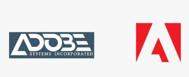
Image Source: Pinterest.
Adobe redesigned their logo with stacked logo symbols and update font to give a fresh vibe to the brand. They made the changes considering its growing and diverse community.
Sonja Hernandez, Senior Experience Design Manager, Brand, Icons, and EGD at Adobe summed up the need for changes saying, “The changes we’re making the focus on ensuring the mark is as functional as possible at all sizes and across all surfaces. With that context, we are shifting to a single color, all-red logo, and are refreshing the specific color red to be warmer and more contemporary.”
2. Batman from DC Comics

Image Source: 1000logos.
Many famous comic book characters are a brand in their own right, especially those who have had entire cinematic franchises built around. One of the most iconic superhero logos is that sported by Batman. The well-known symbol of a bat in flight has been redesigned a few times since its inception, with the new logo released in 2000 showcasing the true, dark nature of the character it portrays.
Recommended for you: Trending Responsive Web Design Frameworks in 2021.
3. Instagram
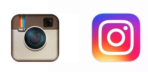
Image source: Quora.
Instagram was started as a photo-sharing and editing social outlet. But over time, it has become an accessible platform for users to showcase diverse beauty standards, exotic places to explore, best restaurants to dine in, and more. It also serves as a networking website and content creation platform for brands and influencers.
Head of Design at Instagram, Ian Spalter said, “The logo was beginning to feel…not reflective of the community” adding, “We started with the basics, removed ornamentation, and flattened the icon. And we arrived at a brighter, flatter option…we knew that people loved the rainbow, and the camera lens was a key visual element.”
4. Mastercard
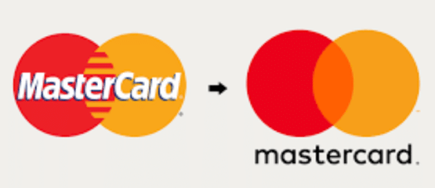
Image Source: Adweek.
Mastercard wanted their customers to know major changes within the company. The company focused on innovation and advancements for the future while maintaining the trust, security, and convenience of their customers.
Chief marketing and communications officer at Mastercard, Raja Rajamannar stated that “Reinvention in the digital age calls for modern simplicity” adding, “and with more than 80 percent of people spontaneously recognizing the Mastercard symbol without the word ‘Mastercard’ we felt ready to take this next step into our brand evolution.”
The company is all set to step into the digital future. Therefore, it was necessary that the Mastercard logo reflects the evolution focusing on simplicity, modernity, connectivity, and seamlessness.
5. Dunkin’ Donuts

Image Source: lisaannpatterson.
With competitors such as Einstein Bros or Starbucks, Dunkin Donuts decides to regain its dominance as the best-baked goods and coffee chain in the market space. The massive rebranding campaign enabled the brand to attract new customers and boost sales. The company was clear on their intentions and did the following while rebranding:
- Changed font and used a slightly rounded one.
- Shortened its names to Dunkin, it was Dunkin Donuts earlier.
- Modernized their stores investing $100 million.
CEO of Dunkin’, Dave Hoffman also said that “Our new branding is one of many things we are doing as part of our blueprint for growth to modernize the Dunkin’ experience for our customers. From our next-generation restaurants to our menu innovation, on-the-go ordering, and value offerings, all delivered at the speed of Dunkin’, we are working to provide our guests with great beverages, delicious food, and unparalleled convenience. We believe our efforts to transform Dunkin’, while still embracing our incredible heritage, will keep our brand relevant for generations to come.”
Moreover, the strategy also focused on breaking their identity as the only “doughnuts” selling eatery. The brand wanted to rebrand and reemerge as a brew-led chain as they have extended the menu by incorporating teas and coffees.
6. Cadbury Dairy Milk
Image Source: Creative Bloq.
Cadbury is one of the brands that decided to redo its historic logo, following innovative digital executions in 2020. The UK-based chocolate giant Cadbury went for the original signature of William Cadbury, the grandson of the company’s founder in an attempt to humanize its existing logo.
Moreover, the brand made alterations to the packaging as well by incorporating newer typography and iconography and redoing the wordmark. New adjustments enabled the brand to appear natural, authentic, and high quality.
The brand manager of the firm, Pippa Rodgers added that “The new identity is grounded in the original intent behind the brand, linking where Cadbury came from with what it means to shoppers today – a truly authentic brand and great tasting, quality chocolate.”
7. BMW (Bayerische Motoren Werke GmbH)
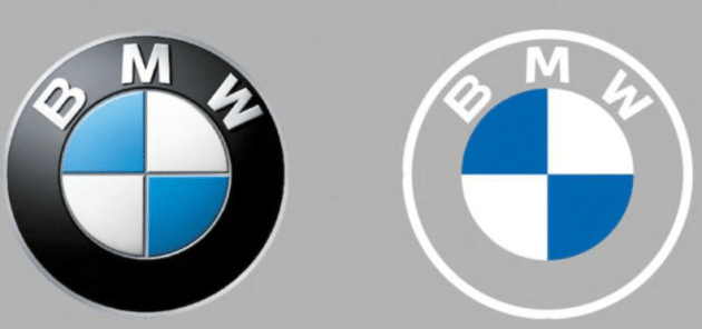
Image Source: The Verge.
After two decades, the German automaker decided to modify its iconic logo. The new logo doesn’t contain black color and 3-D shading like its predecessors. The revamped logo has a flatter and spare aesthetics.
The brand’s executive, Jens Thiemer stated that BMW’s new logo will be used across the brand’s internal and external communications to “radiate more openness and clarity.” He further added that the new and transparent logo would “invite our customers more than ever to become part of the BMW world.” While giving the reasons behind logo redesign, Thiemer further said that “BMW is becoming a relationship brand.”
The brand intends to attract a younger and digitally native audience by becoming more transparent.
You may like: Why Your Business Should Consider Custom Web Design?
8. Intel
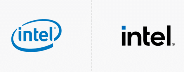
Image Source: Dabblle.
Intel planned to redo their logo for the first time since 2006. It comes with the release of new 11th generation Core PC processors and a new chip brand, Evo. The logo redesign might occur to keep up with the new era competition.
The company simplified the logo by dropping a circular swirl. Intel said that the redesigning “honors the past to forge the future.” Also, the simple and smooth typeface adds more aesthetics than the previous circular logo.
On the other hand, Intel kept the color scheme the same as before. The bright blue color with extended variants draws attention. If you look closely, the “i” has a square dot that represents a processor. You will see a different shade of blue in each setting.
Logo Redesign and it’s Advantages

An innovative logo facilitates brand identification, supports trust, and communicates your message effectively. It also enables your brand to stay relevant to its target audience allowing you to carry out different business operations such as selling products or promoting services with ease.
Moreover, the logo helps in making your company or organization recognizable. Therefore, you need to consider it as a major part of your business. Many brands redesign their logo as it draws attention, facilitating your marketing practices, communicating your values, and attracting new audiences.
It’s true that logos won’t stay relevant or effective for a long time. If you don’t focus on logo redesign, you’ll start to see its drawbacks such as sales declining. Logo redesigning might be one of the boldest steps you need to take but it’s essential for the following reasons.
Even more so, in this time and day, you can easily revamp your logo just like those big brands we’ve listed above – but without professional designers or spending your entire budget on it. For example, thanks to such unique tools as the VistaCreate logo maker, you are also free to redesign your logo in multiple ways – add or remove objects, minimize and simplify current logo design elements, change backgrounds, add animation effects for web versions of your logo, and more. This popular logo maker also makes it a breeze to change fonts and texts, adjust transparency, and resize elements in a visual mode. Thanks to thousands of pre-made logo templates, you’ll definitely get inspired by fresh ideas and reasonable changes.
This user-friendly logo maker and graphic design tool is a must for small business brands that also want to achieve a contemporary, simplistic, yet truly expert look for their brand identity represented in a logo.
Promotes Brand Identity

Redoing Your logo plays a significant role in developing a brand identity for your business defining restructuring, reliance, and appreciation for your business.
Represents Brand

Revamping your logo can keep you two steps ahead of your competitors. While designing the logo, you need to ensure that it communicates your message and depicts the true image of your brand. However, don’t forget to secure your logo rights and prevent them from getting pirated. That’s why it’s beneficial to how to copyright a logo to protect your brand identity.
Builds Lasting Impression

Logo redesigning gives you an opportunity to make your logo professional yet futuristic design, it implies professionalism and proficiency that move potential clientele to choose your business over your competitors with mediocre logo design.
Builds a Positive Image

Redesigning your logo helps in shaping customers’ perceptions and earning positive feedback about your brand. A logo redesign can refresh your brand’s image among your consumers.
Promotes Business Development

Have you started your business years ago and need to incorporate new products or services? It’s best to give your logo a revamp. Redesigning your logo enables your customers or audience about new developments in your business.
Improves Visibility

Complex logo designs aren’t bad but sometimes they don’t prove to be beneficial for your brand. When it comes to printing, your logo is unlikely to retain fine details that make it unique. That’s where redesigning your logo comes to rescue you. It helps in simplifying your logo making it more visible and understandable.
Helps Boost Revenue

You won’t believe it but revamping your logo can lead to a profit increase. When people see your redesigned logo, they are likely to talk about it, which ultimately boosts brand exposure. It also gives people an opportunity to learn more about your brand, products, and services.
Attracts Attention Towards your Brand

It’s hard for your audience not to notice the changes you made while redoing your logo. If redesigning helps you get the best design, it will help in building some PR and promote conversations featuring your logo redesign.
You may also like: How to Design a Website with PowerPoint Templates?
Summing it Up!

Brands often prefer to move towards flat, simplistic, or 2D logos. The approach makes their company or business appear modern and futuristic. Simplistic logo designs are great to achieve a clean and minimalistic look as well. The simple design also works well on websites and enables you to convey your brand message effectively.
As a part of their logo designing process, they encouraged their employees to draw options for the new logo from memory within five seconds. Most of the people drew lenses, a viewfinder, and a rainbow. Following the insights, they translated these elements into an innovative icon maintaining balance between versatility and recognition.
This article is written by Anas Hassan. Anas is a content consultant at leading content writing agency eContentSol. He has vast experience in providing web copywriting services and content strategies. Besides this, he is an avid football fan and enjoys an occasional steak dinner.
 This article is written by Anas Hassan. Anas is a content consultant at leading content writing agency


