What a year has it been for logo design techniques! People are constantly craving something attractive and unique keeping graphic designers on their toes throughout 2015. While some used different types of typography, others stuck with keeping the logo simple for grabbing eyeballs. Now, as marketers and entrepreneurs look forward to the trends of 2016, let’s take a look back at the year’s top trending logo design techniques that proved to be game-changing for many. Some of them might be useful for the coming years as well!
1. Saying Goodbye to Fancy Fonts!
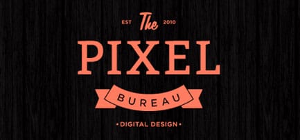
The font that you choose for your logo, be it graphical or word mark one, is crucial in showcasing what type of business you are in. Many marketers felt the need of having a clean font in 2015 rather than those fancy and stylish ones. Clean fonts are easy to read and reflect a more professional look. There are a variety of new fonts available on the web that you can select from. For instance, the following logo displays the perfect example of a clean logo with a font that is much more serious.

2. Mobile Responsive Logo Designs on an Increase
A tremendous increase in people using their mobile phones and tablets to browse the net compelled designers and marketers to create logos that are mobile responsive. Now, logos are designed keeping in mind their digital application. People use mobile for everything these days, right from hiring a cab to shopping to recharging. And therefore, the demand for mobile-friendly sites, designs, and logos is growing day by day. Spending endless nights on designing your logo would go waste if the images do not load or the colors clash when someone is browsing it through mobile. It is a must to make your logo scalable. You should create your logo as a vector so that you can resize your logo without compromising its quality, an article in Forbes explains. Therefore, to improve the user experience, make sure you make a design that is fit for any medium and any screen size, irrespective of the year. Because in the coming years, people will completely turn ‘mobile’.
3. Mixing and Matching of Fonts
There is a wide range of fonts that are available on the web. Marketers in 2015 tried a new technique of mixing and matching different types of fonts and colors and came out with some exceptional logo designs. And it did have an impact on the reader’s attitude in an effective way. A change is always welcomed by the audience as it brings in a hope of getting something different. For instance, you must have come across logos that favored bold letters in between simple text. But make sure that you make the choices of your fonts carefully. Take a look at a perfect example of a logo that has paired different fonts efficiently.
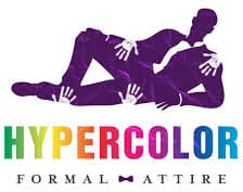
4. Adding Hyper Colors to Design
We agree that a simple design is any day better than a hyper color one. But the trend of using rainbow colors in your logo design grew incredibly in 2015. According to an article in HelpScout,
“in an appropriately titled study called Impact of Color in Marketing, researchers found that up to 90% of snap judgments made about products can be based on color alone”.
However, one needs to be careful while making a colorful logo as adding too many colors will confuse the readers. It should be done tastefully and in a way that it breathes life into the flat, insipid design. Will this technique make a wave in 2016 as well? You bet!
5. Black and White Logos Made a Comeback!
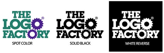
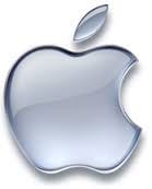
It is indeed a colorful world! You might be thinking why we are talking about black and white colors at all. We know that many black and white logos had retired a long time ago, but 2015 saw the return of such logos, and that too with a bang! Though serious colors, black and white represent wealth, elegance, and sophistication. Some of the big brands such as apple and Nike have kept their logos black and white. The Black and white color make the logo versatile to be used anywhere and everywhere. For instance, have a look at the logo of the Logo Factory which uses these on different social media platforms.
6. Simple Logos are Best, Right?
This is one technique that will always rule no matter what. None of the other points can beat this one. To keep your logo simple is a must. A simple yet powerful logo proves to be the best icon to stand out from the crowd. Also, it stands the test of time. According to an article in Hubspot, less is more and simplicity is more impactful. Always go that extra mile to make your simple logos something that the whole world remembers. For instance, the bite in the apple makes the Apple logo iconic. Check out!
7. Rise in Mosaic patterns
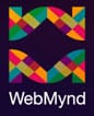
The Mosaic pattern is one of the hottest trends of 2015 which was used by many designers. They are easy to create and provide opportunities to resize them on different mediums. They are the booming trend in logo designs and will most probably be used by designers in the years ahead. They help designers make images that are modern as well as timeless, according to an article in CreativeBloq. For example, take a look at a mosaic logo design of WebMynd that features a blend of bright colors making up the company’s initials. Isn’t this amazing?
8. The Return of Vibrant designs
In the pursuit of having a simple logo, many designers forget to add a pinch of vibrancy into the logos. It is one quality that was missing for many years in the logos but made a comeback in 2015. The last year saw designs with more creativity, life, energy, and color. Such logos stick in the mind of the target audience and prove to be beneficial for your business.
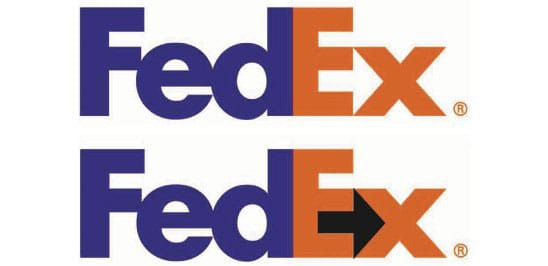
9. Using the Negative Space
Negative space is nothing but doing more with less. This technique gives you an opportunity to show your creativity and wittiness in careful placement of details that is available with you. The best example of this is the FedEx logo with its arrow in between. We hope it hasn’t missed your eye too. There are many people who see the logo every day but are not able to notice the arrow. See for yourself!
10. Looking cool with 3D
The 3D logos returned with a vengeance in 2015. Such designs give a refreshing look to the logos by breaking the clutter and make it more appealing to the audience. Also, it stands out on the mobile platform. It keeps the viewers engaged as it is youthful, innovative and reliable. It is the latest trend and you will see it being used by many designers for attracting people. Take the example of the logo of Sony Ericsson which is both futuristic and flexible.
Final Words
Logo designs have seen a lot of changes over time. I always look forward to when a company launches its logo. These few pointers might help you in making that perfect logo for your company. But don’t forget these are the techniques that were trending in 2015. A new year will bring with it a whole new set of trends and developments. Just remember, there is no ‘right’ way when it comes to logo design. Explore and create, the whole world is yours!
This article is written by Alice Jackson. She is a Blogger and Digital Marketing Consultant at a crowdsourcing company, Designhill. She is a social media enthusiast, online market analyst, amateur designer and an avid author. She has written on several topics including social media marketing, content marketing, designing trends, startup strategies, and e-commerce. When not writing, she loves spending her time reading romantic novels.