Imagine life without colors. The first thought that may come to your mind is an image of a black and white movie. What if everyday life would be the same? Just like cats and dogs – they don’t see what we see. They see black and white and alterations of greys. Since the digital marketing industry constantly evolves, it was only a matter of time until marketers and psychologists understood the significant importance of color in branding, advertising, and sales.
Nowadays, when you start a brand, the first thing you think about is what colors will your brand represent. How will the logo look? Will it send the message you’re trying to send? Does it showcase your brand’s value? Is it attractive? Will you use one predominant color in your branding? Two? Three? And which?
There are many questions concerning this topic. Color marketing is an abstract yet extremely relevant preoccupation of digital marketing that will significantly improve your brand’s identity and performance over time. Just remember: visual communication is key.
In today’s post, I’m going to showcase the importance of effective color use for brands and businesses that aim to “go big”. Pay attention, take some notes, and simply apply without hesitation.
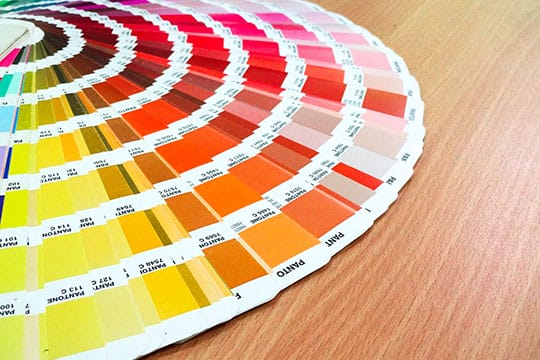
The Basics

Before I tap into any detail concerning color marking, I want to state a clear fact.
Color marketing isn’t 100% accurate. That is because color perception is both subjective and objective. When a person associates a color with a feeling, memories, or likes and dislikes, the effect will depend on the associations created in the past.
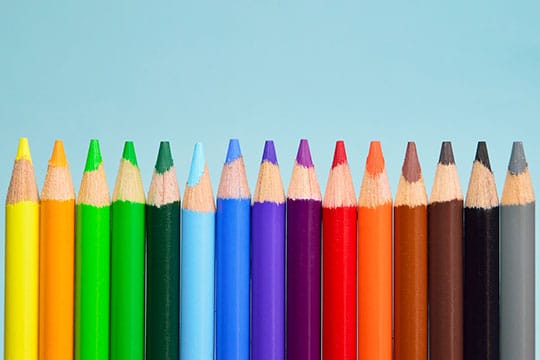
Nevertheless, studies throughout time have discovered many common perception patterns that have eventually started to be leveraged by businesses and brands from all over the world. Again, before I present the importance of color in branding and digital marketing, I will briefly cover the most common understanding and characteristics of the most common colors.
- Black – mystery, death, change, elegance, formality, power, deepness.
- White – goodness, purity, perfection, light, integrity, deepness.
- Lighter Red – passion, joy, love, sexuality, vigor.
- Darker Red – willpower, leadership, anger, courage, wrath.
- Pink – friendship, transcendence, romance, friendship, supreme love.
- Brown – masculinity, calmness, stability, consistency.
- Orange – domination, action, desire, pleasure, sexual lust, aggression.
- Gold/Yellow – wealth, knowledge, illumination, wisdom, intellect.
- Darker Green – ambition, jealousy, sacrifice, greed.
- Lighter Green – vitality, nature, joy, calmness, peace.
- Aqua – protection, healing, light emotions.
- Darker Blue – power, seriousness, commitment, knowledge, strength, confidence.
- Lighter Blue – tranquility, healing, softness, health, positivity.
- Darker Purple – sadness, melancholy, darkness.
- Lighter Purple – romanticism, love, passion.
Recommended for you: How to Use Social Data Analytics to Launch a Successful Marketing Campaign?
Color Affects Purchasing Intent
after studies show that colors are strongly influencing the purchasing intent of customers. The premise is quite simple: since some colors have universal meanings (with slight differentiation), the culture’s associated are embedded in our subconscious mind.
Let me make that simpler: when you are born as a human being, your brain will start receiving various unconscious signals. The first thing that babies try to do is to mimic their parents.
Not only that they try to understand and mimic the physical behavior, but they also receive subliminal mental messages. Basically, the environment is always shaping the way we see things and the way we perceive everything in the world (including colors).
Therefore, studying and implementing the right colors in your branding, web development, and digital marketing campaigns is a concrete and productive way of boosting your results and reaching your specific objectives.
Color Makes People “Tick”

When people choose products from supermarket shelves, the primary differentiating factors they use to judge products are color, brand, and price – in that exact order.
A recent study shows an impressive fact: 90% snap purchasing decisions (snap judgments) are influenced by color alone.
That depends on the product, though, as a different study shows that the majority of consumers build their relationship with brands by assessing the “appropriateness” of the brand and product colors.
Color Makes Content Look and Feel Better
We don’t need any studies to realize that colors are a blessing for our eyes. Again, try to imagine how your existence would be like if you’d be able to filter only black and white. Some people are born that way, by the way.
If you enter a black and white website, you’ll probably feel like you’re navigating an ancient ruin developed by an ancient person. That is not the case with black-and-white logos. Black and white inspire simplicity in design.
When you write blog posts, for example, black and white make up 90% of the articles. However, the other 10% is critical to generate great user engagement. Quality visual content perfectly completes the equation, thus making the final piece visually appealing and simple to digest at the same time.
You may like: Digital Marketing Tips for Startup Seeking Brand Recognition.
Color Helps Your Build Your Brand’s Image and Identity

A brand’s mission, other than profits, is to differentiate itself from the rest of the competition and stand out from the crowd.
Differentiation is key in branding and advertising, and everyone’s seeking it. If you understand the power of color psychology, you’ll be able to enhance whatever you’re trying to accomplish.
For example, developing your brand’s personality can be easily done through colors only. Surround your website and products around the color that represents your brand’s mission, values, and principles best and implement it consistently.
Our subconscious minds prefer the familiar. Therefore, whenever our eyes spot a recognized brand, we have a tendency to choose that brand over the rest. Studies show that your brain is determining what products to buy before you even start addressing these matters consciously.
Therefore, as a brand, you want to create the associations between your brand’s name and your brand’s colors. Just like the big brands do – McDonald’s, KFC, Apple, Facebook.
Color Helps You Attract Attention
Consider this for a second: if you’d use a brownish color CTA (call-to-action) on your website, how many people do you think will be tempted to click? Here, let me show you an example:
- Buy Now vs Buy Now
- Go to Purchase vs Go to Purchase
![]()
There are three strong colors (black, white, red) and a secondary one (skin color). The simplicity of this design makes it stand out from the rest, as well as the contrast between red and white. Fast foods often use red to create a sense of urgency, desire, and carnal pleasure.
On the other hand, you can use colors to improve your educational content. Since most of us are visual learners, the colors used on a guide will help visitors understand the “message behind words” even better.
Color Shapes Your Brand’s Personality

Using a predominant set of colors in your branding, PR, digital marketing, and advertising campaigns will help you communicate your brand’s personality in an indirect and non-verbal way.
If you want to be the “confident” brand, go for blue. If you want to show sensuality, go for red. Or, if you want to show status, go for gold. Of course, this will be the predominant color you’ll be using to design your brand and products. It doesn’t have the be the only color you use, but rather the one you take into consideration first.
It all begins with your brand’s values and principles. That is the most important factor you’ll need to assess before choosing your brand colors. What are you really trying to communicate to your audience? Find that out first and you’ll be able to easily pick a representative color.
Color Can Improve Your Personalization and UX
Here’s a coverage posted by a popular magazine that shows the different men and women preferred and less preferred colors:
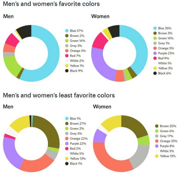
If you’re selling to a target audience that’s composed mainly of women, you’ll want to design your branding and digital marketing around the colors that women unconsciously prefer.
Research shows that women prefer softer colors, while men tend to be attracted by bold ones. Another interesting study suggests that men are extremely attracted to shades that are close to black, while women go for shades, hues, and tints that are close to white.
You may also like: How to Launch Your eCommerce Brand Quickly & Successfully? – 5 Rules to Follow!
Final Words

Since our subconscious minds are triggered by symbols, imageries, and colors, knowledgeable brands can easily play with our minds. The biggest international brands (and not only) already do.
When a potential customer sees or hears something, a sound, a symbol, a color, his brain instantly connects to past associations and triggers various responses. Besides that, as you have probably understood, every single color makes our brains react differently.
Some effects are aggressive, others are sad, joyful, calming, and so on. Learn to use them in different contexts (branding, website, within the content, videos, advertisements, etc.) and you’ll experience a huge performance boost in every future marketing campaign!
This article is written by Michael Gorman from BrillAssigment.co.uk. He is a passionate assignment help writer and editor from the UK who loves to write content each day. Being interested in psychology and marketing, he writes various articles that relate to his personal experiences as a marketer and freelancer. Feel free to contact him via Facebook or check his Twitter.
 This article is written by Michael Gorman from