From the color scheme to fonts and title design, every small detail matters if we are talking about a big digital project like your website. The usage of different fonts and font effects can bring both a negative and a positive impact on your users, and it’s entirely up to you whether it will be positive or negative. Balance, a harmonical way to connect all these details into one well-organized creation, is of paramount importance for every digital designer.
Fonts and font effects are the best way to achieve that equilibrium because, for most web pages, the most significant amount of visual data is occupied by body texts, titles, and headings. Therefore, you can adjust the number of simple and complex details in order to receive the perfect outcome.
Open Sans
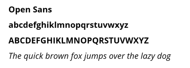
Open Sans is part of the sans serif typefaces meant to give the highest readability and user experience. This web font is the best choice for minimalistic websites with a lot of information to consume (blogs, informative articles, etc.). Another great perk of this font is its compatibility with many different styles.
Recommended for you: Best Fonts to Use in An Infographic.
Lato
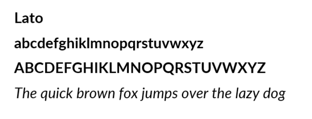
Lato is one of the best fonts to use if your website activates in a severe field such as finance, law, or even accounting. Easy to use, this website typeface is considered more of a corporative font that portrays high professionalism. Lato is the best font for those who want a modern way to enrich their site’s design.
Helvetica
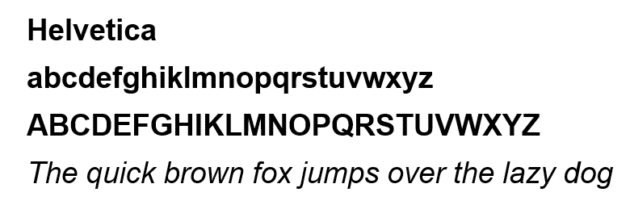
Being one of the most used website typefaces globally, Helvetica came to light by Max Miedinger, a Swiss designer. Helvetica has won its popularity due to its incredible variety of styles and sizes, which helps designers choose the best versions for their particular creations.
Merriweather
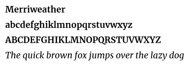
If you have various audiences that read your content on both big and small screens, the Merriweather website font is the one you must choose. This proportional font combines a stylish look with a drop of simplicity, a phenomenal merger with a lot of potential for sites in various fields. Merriweather is perfect for formal and informal styles.
Playfair Display
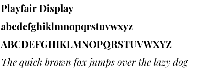
Playfair Display is a stylish font with a bit of classic trait. If you choose a font for a sophisticated website, Playfair Display is definitely your choice. It’s perfect for light, aesthetic websites with easy-to-understand content. Indeed, Playfair Display is not as readable as other fonts; its main advantage is the class.
Montserrat
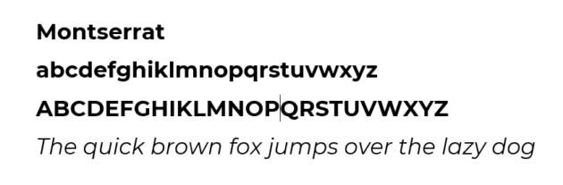
This sans serif font is nearly the best website font you can choose from. Its geometrical style typically permits you to find a way to implement it on your website. Although Montserrat is very stylish, a lot of people find it readable on both small and large screens.
Libre Baskerville
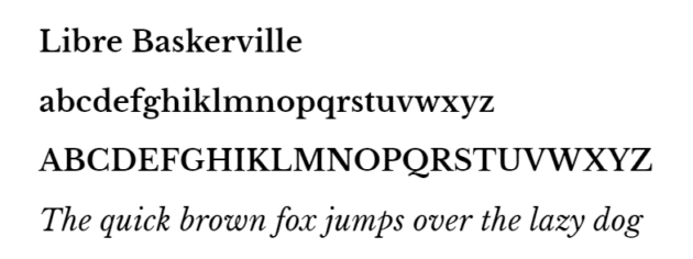
Libre Baskerville is a serif font inspired by its 18th-century predecessor. Its classic style is perfect for usage in a wide variety of fields such as economics, sports, and beauty. Although Libre Baskerville is very popular, it is not the best option if your audience uses large screens to access your website because the font doesn’t look so well when its size is too large.
Caudex
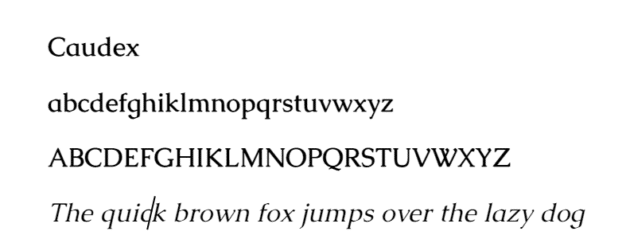
Initially used in medieval manuscripts, Caudex was reformed and adapted to our reality in the late 90s and hasn’t stopped its development since. The Caudex can be used for both paragraphs and headings and is, without any doubt, the font with the largest variety of styles available. It’s great for both large and small screen usage.
Barlow
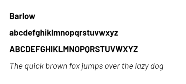
This sans serif font Barlow seems to be inspired by Californian license plates and highway signs. Its clean design can bring some smoothness into your website, making it more cozy and easy to read. Another great perk of this typeface is the compatibility with many other fonts that can be found on your website.
Roboto
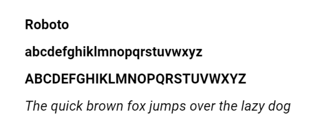
Plain and simple are the adjectives that perfectly describe the font Roboto. Its primary purpose is to deliver the information to your customer without any complications in style. It is considered a professional font but there are cases where designers use this font for friendly content.
You may like: 20 Stunning Logo Design Fonts that Every Great Designer Needs.
How to choose the right font?
The right font is usually the key to a more significant number of users for a website. Therefore, the ability of a designer to choose it correctly can have a positive impact on users’ experience and their reviews.
Choose the fonts according to the website’s content

It’s not a secret that, in most cases, the biggest part of your website will consist of different types of text. Therefore, if you want a stylish, well-arranged website, the first step to achieving that is choosing the right font for that text. The greatest tip for you don’t use more than 3-4 fonts on one page; it will look awful and messy. That is why, given the existence of many various fonts, you should choose the ones that are the best for you in particular, don’t push it too far.
The most confusing for people is combining the fonts and the design of the website to receive a great and stylish merger. In fact, it is a lot simpler than you think. Some fonts are best for sites with a lot of severe and informative content, and there are fonts for fun and superficial content. You need to understand what type of content you will be writing. Usually, fonts like Times New Roman and Robotica are used for informative content because of their severe and minimalistic style, and fonts like Playfair Display are perfect for leisure content.
The three types of fonts

Like I said in the paragraph above, your site should not contain more than three typefaces. But what are those three, and how do you choose them? You will find out right away.
- The first font you will use in your headings, subheadings, and titles is of paramount importance. This primary font should be directly associated with your brand and mirror its philosophy. If you have a minimalist brand, the primary font should be as minimalistic as possible in order to reflect its philosophy. If it’s possible, you should choose the same font used in your logo if you have one.
- The secondary font will be used to write the biggest part of your content. It should be simple and easy to understand even if you have a more sophisticated design for the rest of your website because this part of the text ought to be as readable as possible for the majority of your users. You cannot choose a stylish font that will be hard to understand. It’s literally inadmissible for this part of your site.
- The third font is optional and will be used to accentuate some parts of your text and catch the attention of the reader faster. Here you can use some more sophisticated fonts but don’t push it a lot further than your secondary font; they should have some similarities in order to combine perfectly.
Remember, the more typefaces and fonts you choose for your website, the harder it will be to combine and harmonize them. Generally, more fonts mean a messier design for your website. It’s as simple as that.
Know the basics

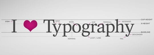
Typography is an art, and, like every kind of art, it’s hard to learn and comprehend every aspect of its existence in a heartbeat. However, some basics can help you choose the right font for your website. The classification of fonts is of paramount importance for every designer that has to choose a font for his website. Here you will find a quick yet informative summary that will help you understand the difference between them.
Serif fonts:
It is regularly used when the information you are typing will eventually be printed. Classic and stylish, serif fonts are not commonly used as web fonts because of their elegance. However, if you choose to write about finance, law, or fashion, this is your pick. Times New Roman, Georgia, and Bodoni are serif fonts.
Sans serif fonts:
These fonts don’t have the serif lines at the end of their letters as the serif fonts do. Modern and straightforward, web designers usually use these fonts because of their neutral look. These fonts can be used regardless of the topic you are writing about. They are usually an excellent fit for the mass of the issues. Helvetica, Robotica, and Open Sans are some famous examples of Sans serif fonts.
Script fonts:
These fonts are modeled after the handwriting styles. They are typically used at headings, subheadings, and highlighting some essential parts of the text. You mustn’t use script fonts to write body text as it would be a challenge for the reader to understand and comprehend the information. Lobster and Lucida Handwriting are script fonts.
Remember, the more typefaces and fonts you choose for your website, the harder it will be to combine and harmonize them. Commonly, more fonts mean a messier design for your website. It’s as simple as that.
Another basic knowledge that is crucial to know is how to emphasize a different part of your text. Usually, in order to make some details stand out from the rest of the text, many authors use bold or italic. It is a good choice, but if you want to be original, you can use a different type of font as I have described above, the third font used to emphasize.
You may also like: 5 Web Safe Fonts That You Can Use in Your Website.
Don’t forget about the load time

We are living in a period when the most precious resource that a person can have is time. Therefore, nobody wants to wait long for a website to load in order to see fonts that are more sophisticated or beautiful. Normally, the person will choose another site to receive the information he needs faster. Choosing the fonts correctly can significantly ramp up the speed of your site. How to do it? Here are some tips.
- You already know many reasons why a large number of typefaces on a single website is the worst thing you can do. And this is another reason to stick to 2 or 3 of them. More fonts mean a more significant amount of data that must be processed, and that takes time.
- Don’t overcomplicate the design with a lot of beautiful but useless that will only make things worse. For example, it is a good thing to use a well-designed font for titles and headings. But for the body text, it is more reasonable to choose a basic font like Robotica or Helvetica.