‘More Traffic’, ‘More Conversions’, ‘Increased brand awareness, like most digital marketers these are the direct goals of your marketing strategies. To achieve them, you need ‘What’ and ‘Who’ decisions.
- What your brand is.
- Who your target audience is.
This decided you can then break down your strategies into the necessary elements. If you are reading this article, you are thinking in the right direction. ‘Website color schemes’ is a strategic and handy marketing tool and you can read on to find out why.
It is quite simple really, as people we use our five senses to guide in decisions, sight is one of these, and visual awareness is an essential part of recognizing and choosing brands.
As per research, 85% of the customer’s purchase decisions are made on color scheme alone.
Color psychology is complex and full of nuances, but at that percentile, it is worth spending some time getting to know them a little better to provide a better visual element to your marketing strategies.
Haphazardly throwing paint onto a canvas and rolling in it might work for some artists but it is not the way forward for your brand image or website. Understanding how color affects us is the first step in choosing a website color palette that will create the impact you want.
Recommended for you: Best eCommerce Store Color Combination for Better Conversions.
Color Impact

Black

This is a powerful color medium, indicating credibility, strength. It reflects professionalism and is precise and direct.
A slick, modern color used for; fashion, manufacturing, cosmetics, mining, tradespeople, construction, and corporate branding. Black provides a luxurious, sophisticated feel. Avoid the dark side if you are looking to promote economy or affordability.
Green

This versatile color has many cultural tie-ins reflecting the natural world, ecology, and organic sustainability. It has youthful implications, is calming and nurturing yet instructional and informational.
Green is an excellent color to incorporate into your brand and website if you are in ecological businesses, human resources, tourism, and science.
Blue

A color popular with both sexes as shown in Joe Hallock’s Color Assignment. Blue ensures you are taken seriously. It displays trustworthiness and maturity.
Blue seems to find itself in most logos, it’s credible, compelling, and focussed. Useful for professional, legal, and corporate color schemes for brands and websites, many banking sites use this color, as does Facebook.
Fun Fact: Facebook is blue as Mark Zuckerberg is red-green colorblind. ‘Blue is the richest color for me; I can see all of blue’ quoted Mark.
Red

Dynamic, eye-catching color of excitement, passion, and love. Red can be used as a warning or as a highlight to accent a point or a call to action.
Using red increases the urge to buy and is often associated with restaurants, fast foods, and drinks. Think Coca Cola or Heinz as it is also thought to stimulate appetite
As you can see from this shortlist, colors have an influence, and research has shown its effectiveness. The next question is how to use it.
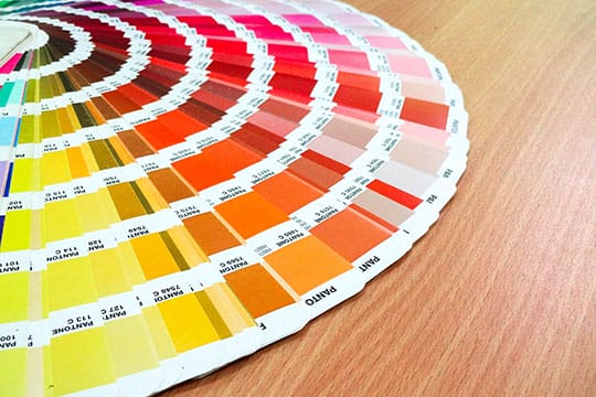
Tools For Website Color Schemes

The more colors you choose to use, the more chaotic your site can become, sending mixed signals to your customers.
A rule of thumb is to go with three colors in a 60-30-10 combination:
- 60% as your primary color, the dominant shade throughout your site. This can be used for prominent elements such as the header, background or title text.
- 30% is your secondary color; this complimentary shade is useful for, menus, lower level headings and points of interests.
- 10% is your contrast or accent hue. Smallest amount but very necessary these are used sparingly and with purpose, highlighting important CTA’s is one such use.
If you need to use more than three colors, then look to the various tones or shades of the colors you have chosen. These tints can be applied to sidebars, captions, and tables, creating an easy-on-the-eye flow that doesn’t clash with your website color schemes.
To assist you in choosing the color palette for your website take a look at the Abode Color Wheel Tool. This tool has several options for you to consider once you have chosen your primary color. You can find subtle blending or contrasts that ‘pop’ with Analogous and Complementary color schemes. For a more adventurous approach view their Triad and Compound color schemes.
You could also try out:
Don’t be afraid to experiment with the various colors to achieve the effect you want, but do remember that cultural perceptions can be very different. White, for example, is considered a symbol of purity and peace in Western cultures. Yet, in Eastern cultures, it is symbolic of death.
Not all colors are the right ones for your business, you need to take your time and remember what you started with, the ‘What’ & the ‘Who’. Keep the answers to these as your focus for choosing your website color schemes.
If you are targeting women more than men, keep in mind there are gender differences in preferred colors. Women are liking the softer tints, where colors are mixed with white. Men respond better to bold tones, where black is in the color mix.
Both genders prefer blue and green, and both dislike orange and brown.
You not only want to draw them in with the color you choose but stimulate the personality of the color as people identify with it. An example would be using green as a primary color to attract people who identify themselves with nature or tranquillity. Want to be known as youthful and optimistic? Then incorporate yellow as your 60% color.
You may also like: 9 Tools Every UX and UI Designer Should Have in 2018.
Should You Use A Color Scheme As Part Of Your Marketing Strategies?
Absolutely! To not do so is to miss out on an essential element to drive your business forward. Just remember five key points:
- Picking a color is not a haphazard task, it needs to be organized, objective and well researched.
- You need to make a mental connection with your target audience. The colors and designs need to stand apart from your competition. Remember to check your competition for ideas!
- Put your audience first.
- Have fun choosing your colors but don’t forget content should not be lost in a rainbow of colors!
- Remember the rule of color combinations to keep your design and color combination tight.
This article is written by Georgi Todorov. He is a digital marketer recently started his own blog about digital marketing called DigitalNovas. His passion is to help startups grow and thrive in a competitive environment. Hit him up on Linkedin or Twitter.
 This article is written by Georgi Todorov. He is a digital marketer recently started his own blog about