Along with the content and marketing strategy, one of the core ingredients of the website success is a competent design. So you cannot rely on luck or just on your intuition when it comes to the design decisions. The best way is to learn from the mistakes of others, who by now through trials and errors figured out the essentials of design strategy. If you want to reduce a bounce rate of your website (and you want, of course!), the following tips will come in handy.
Make it easy to find things
The prime reason the users leave your website right away is that they don’t know where to go next. Your task is to make it ridiculously easy to navigate around the site.
First of all, you cannot guarantee a precise navigation unless you have a thought-out informational architecture. IA can have a form of a map that shows and what are the main categories of your content and how keywords overlay it. Yet, above all, it can clarify for you how users will move from one page to another.
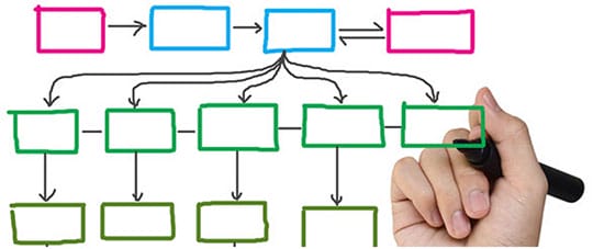
Ideally, IA should provide the link between your business, content, and users. In other words, transparent navigation is a front side of a well-thought IA.
Make a ‘call to action’ button obvious. Don’t make it compete with other buttons for the customers’ attention. Let its contrast with the background. It shouldn’t be gray, black or white, use colors and the pleasant ones. Orange and blue, by the way, are reported to be the most realistic colors for the CTA buttons. A great tool for the understanding of what users click and what should be clickable is Crazy Egg.
Don’t distract users’ attention
Don’t overload users with the excessive visual information. The images are great and responsive communicators, but when there are lots of them, they bewilder and distract the user. By the way, banner advertising with twinkling letters will kill your conversion in 2017. When you bomb the users with the alternative offers from the banners, it is hard for them to evaluate your own product. Besides, they lose trust to the pages that aggressively exploit their sight and time. And trust is the basis of customer’s retention. Thus, make your site visitors feel comfortable so they could become frequent guests.
In addition, here works a ‘banner blindness’ effect, so mindless banner placing will be useful neither for you nor the ad publisher.
If you use an icon for the buttons, add to them a clear and simple guiding text that allows users to proceed from page to page without doubts.
Be reasonable about the fall-down lists, chat windows and pop-ups. Pop-ups are irritating and mostly are not effective. An exception here is an e-mail subscribing with the pop-ups’ forms; it shows considerable responsiveness. The direct effectiveness of the pop-ups depends on the right timing; thus, this tool must be carefully thought-out before applying.
Don’t make people wait
It is the point I should’ve started from. The load speed of your side is not something you can compromise with; it is your absolute priority. ‘Slow loading’ is the most common reason for the high bounce rate, so treat performance as an element of your design strategy. To optimize your speed, you should watch the size of the images, avoid redirects and auto-playing video. Include only essential elements to the landing page.
It becomes especially critical when we are talking about the mobile version of the website. The truth is that mobile Internet users are even less patient than those who use a desktop. That is why the promptitude of your site is a priority for your development and design strategy.
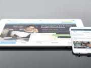
Use responsive layouts
Here we come to an obvious point to make in 2017 – people mostly use Smartphone to be online. For businesses, it means that not using a responsive design becomes one of the clearest bounce rate factors.
To make sure that your website is comfortable for the mobiles, make it fast. Reduce the number of elements to the minimum, use the power of hamburger menu. Some of the experts assume that it is outdated and don’t prove its usefulness. Yet still, there are no tools that can be as effective as hamburger pattern in hiding the multiple-unit menu. It allows you to keep all the necessary elements of your menu and not to make the navigation harder. To check the mobile usability of your website, you can use Google mobile-friendly test.
Make your site visually pleasurable
All of the mentioned points primarily concern the practical side of web design. Yet, you cannot neglect its aesthetical aspect. Flat design, unique typography, and bold colors are considered as elements of design with good manners. Yet they are around for already more than 3-4 years what is a venerable age for design techniques.
Talking about the trend design features for 2017, we witness a comeback of large, colored shadows, hand-drawn-like iconography and color gradients. They create an impression of a friendly and cozy visual environment.
Besides, this year is a time for experimenting with geometry and asymmetry of the visual scheme. Look at the front page of the website dedicated to the Dadaism, dada-data.net.
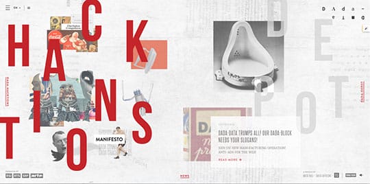
It doesn’t show the simplest navigation, but being a thematic web resource, it relies on a visual presentation. Beautifully designed asymmetry, styled typography, and deliberately chaotic image placement can look captivating. For more examples also check sparkbit.pl, culture.pl, and durimel.io. They all use the decorative and sometimes ‘flying’ details that make an impression of involvement from the first seconds on their front pages.
Final remarks
Design principles are not something you can define for life. Yet, there are some essential points you should follow to not loose in conversion in 2017.
- Make the navigation simple. Give not clues but unmistakable directions.
- Make your website light and fast.
- Design responsive site that is fast on all platforms.
- Make it visually consistent. Follow the standard color scheme and geometry.
- Don’t overdo with the visual filling. Less is better when it concerns the images and functional elements.
This article is written by Veronica Hunt. She is an experienced content marketer from Philadelphia, PA. She sees her purpose in providing people with up-to- date info in the spheres of digital marketing, design, and psychology. Currently, she works for StudentShare, the best online database of academic examples, as a content manager. Apart from work, she adores traveling and yoga. Follow her: Facebook | Twitter | Google+ | LinkedIn.


 Web Developer & SEO Specialist with 15+ years of experience in Open Source Web Development specialized in Joomla & WordPress development. He is also the moderator of this blog "RS Web Solutions".