When it comes to rank a website there are several aspects that determine if the website is ready to be accepted by the jury online. That is the visitors, which contribute in the building up the visibility and rankings of your online presence.
White space can be casually defined as the space or area spared by the content on the web page. It is absolutely free from text, page elements or multimedia content; hence it creates a filter that prevents the page from being suffocated.
To show how negative spacing is held as a prime component is the modern website structure, this guide will help elaborate, better yet, help you implement the principles of white spacing in your website.
What necessitates the use of White Spacing?
Web designers are always concerned about the layout of the page so that it effectively grasps the attention of the viewers. White spacing not only sustains the elements of the page together, but it sets apart the important from the slightly less important as the visitors browse through. Once a website is designed and set afloat on the internet, it will eventually get clicks but will fail in customer retention if the white spacing is not done with the books.
It is possible that your client visits your website in search for products but might not proceed towards the checkout if the page is congested with vaguely relevant content and spammed font all across the corners of the page. The visitor will never able to focus on particular point. So there goes a potential lead!
Cart abandonment is deeply rooted with shortcomings in white spacing and all wise website owners will always take this factor to a serious note if they value the visibility of their pages.

Relating the concepts of White Spacing
It is true that a web page must contain all the necessary information and details about subject matter such as products for Products Page, but it is also imperative that it remains appropriately spaced to keep the content athletic and readable for the user.
White spacing is just like the diaphragm of the human body. It supports the content in the middle same as the muscle supports the organs above it. If it is removed from the body, all the important organs performing their precise functions will consequently collapse.
Steamy graphics, loads of images and videos with fiery content are the requisites of every good website. These elements can best be expressed with modest amount of white spacing, not too less and not too much, but just the right amount. Using too much of it will certainly not nudge the importance of any of these components, so winning an equilibrium between the website’s elements and the white spacing must be maintained.
Implementing with the correct Amounts
Learning to mix an even amount of the negative space in the website requires a considerable amount of study on the contents of your page. Squeezing a lemon might be easy, but without calculating the amount squeezed from it can be disastrous to the food. Similarly, every drop of negative spacing should be calculated for the success of the page.
In order to become the samurai of white spacing you must always train your mind and eyes to predict the correct amount of negative spacing required for the page. A page about sneakers will necessitate the use of HD graphics and colorful images along with product videos, but the text will be short and precise enough to glorify the product.
White spacing is the fence that will separate all these neighboring aspects and elements about the product to illustrate their importance separately.
Macro and Micro White spacing
There are two significant portions of white spacing that designers use. These 2 types are micro spaces and the macro spaces.
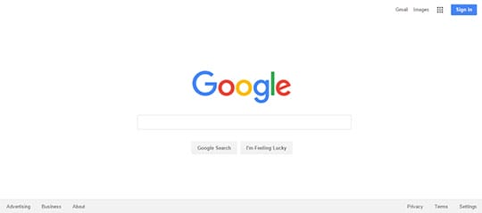
The macro spacing is always the free space present between the elements of the page that have necessary presence such as the primary and the secondary content, the headers with the navigation and the footers. The macro space is basically all the space around the sidebars and the borders which sets the majority area of the web page. Google is the biggest example macro white spacing.
The inside content and the trivial spacing that occupies the regions between texts, navigational links, margins, images and multimedia features is the micro spacing. It is the smaller amount of space that makes a larger difference to their overall view of the page. With macro spacing and micro spacing, an adequately balance design can be accomplished. Apple website is using both micro and macro spaces naturally to differentiate different elements. This allows the total content of the page to remain unchanged while at the same time spread more sense out of it. Macro grabs the visitor’s immediate attention while micro helps the viewer proceed with the reading and watching of the content displayed on the page.

Typography in Text

The font and the text is always a reader’s challenge often when they visit a web page. The size is inconsiderate, and even the text color is to the extent of undecipherable. This results in an absolute abandonment.
The headers and the paragraphs below must meet their purpose and maintain a healthy space to distinguish their correlation without causing them to collapse on each other. The font should be kept clean with point spacing and while extra margins should be used more often to please the eyes of the viewer. UpWork is good example white spaces in text.

Minimalist Design Concept
 Minimalist is not just recognizing the need of implementing the important and the necessary, but it is way more than that. It is the talent that defines a designer in the pursuit of making something complete by shredding all the extra weight before it becomes a totem of perfection. This is not easy and takes quite some time and effort to graduate, and eventually master.
Negative spacing with minimalism is best used on the needy regions such as the Header, Footer and the Middle Ground content. A good spacing cannot be significantly observed as it maintains a close equilibrium with the surrounding aspects of the page.
Keeping a sound standard of typography along with sharp and necessary content that stands with the latest trends can produce an ideal minimalist design that most of the viewers of their era fancy.
Every Website needs it
White spacing is not just supporting a clean and viewable image of the web page but it is also one of the principal rules of web designing. Showing a good balance is necessary not only for the page to attract visitors, but create customer retention for increased online rating and conversion rates.
Trends must be taken into account with the changing era and customer behaviors. A web page that distinguishes the elements and the injected content is a thumbs-up for Google rankings, because such standards are primary for online grading of the website for popular search engines such as Google.
This article is written by Asad Ali. He is a professional eCommerce expert with more than 7 years of experience. He is currently working for a Dubai based web agency known for its quality web design services. Follow him on Linkedin.