The sudden upsurge in the frequency of people adopting mobile phones for browsing the web has made it a mandate for web design agencies and developers to ponder as to how they should create websites that can cater specifically to the mobile-first audience. However, a web design is not successful with just a responsive layout, an aesthetically beautiful UI(User Interface) and an eye-catching content that renders well on every device. There is more to it when it comes to mobile and it is Mobile UX – The User Experience on Mobile.
UX is more or less like an art which is closely related to psychology – reading the mindsets of the consumers and optimizing the web designs to enhance usability on multitude of devices that fit comfortably to everyone’s palms.
Today, Mobile UX optimization is not only the hot buzzword amongst web developers but clients also. If you are someone from the Business Development Department of a web design company, you might have come across questions like “Do you optimize your design for the iPhone ??”, “Can you show us a good portfolio of the mobile websites you develop ??” , “What mobile commerce websites have you designed so far ??” ; asked every now and then by the clients. And those who are behind this race of going mobile, I can see those small drops of water on your head right now!! But, truth is truth ,you have to accept the change and make peace with it. Everyone knows that a well optimized mobile site generates hefty traffic, boosts customer engagement and thus increases sales to a great extent. Even the ecommerce market is densely populated with smartphone users and big shopping sites claim to generate more than 50% revenue from the mobile traffic in Q3 2013.
So, here I decided to unveil the top 3 web designing secrets for a successful mobile UX. Read this post between the lines and resolve to not just deliver good designs but a hassle-free experience on all finger friendly devices that are used by most of the web traffic across the globe.
TOP Secret 1 – Map Consumer’s Engagement Journey : Try to make everything easy on the eyes and smooth on the fingers
Tracing the journey that a customer goes through while engaging with your web design, from start till end, is the first brick that should be laid in building a website with successful Mobile User Experience. Typically, there are 3 factors involved in this :–
1. Ensuring your Mobile content is “easy to read” on eyes and “easy to tap” with fingers
This involves figuring out the accessibility of your web-content on the mobile devices of your users and optimizing whatever seems to be difficult in reading or tapping. Some of the best practices include –
- Keeping proper padding and extra space between your “call to action” buttons otherwise users may click one thing and end up landing on something else.
- Putting a minimum limit of 44X44 pixels (the normal finger size) on small but important design elements or widgets so that everything is easily accessible by everyone.
2. Take care that your users don’t get irritated scrolling down endlessly by optimizing your Mobile Navigation.
When designers turn to responsive layouts for mobile audience, they often get lost in optimizing just the UI part and completely ignore the UX. A responsive layout typically eliminates the horizontal scrolling and lays down all the content vertically resulting in super long pages that end up frustrating all the visitors.
Here I have jotted down the 3 quick alternatives to get rid of this –
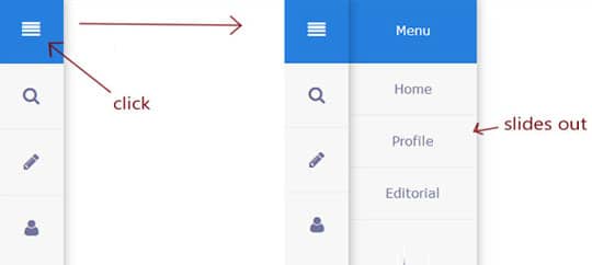
a) Switch to Icon based vertical menus:
Icon based vertical menus are the best option when it comes to optimizing for Mobile UX. You might have seen such menus in the mobile sites of well established brands. A good example is Facebook Mobile Site wherein you see a small black icon on the topmost left side of the header. Below I have included an image to help you understand what do I mean with vertical Icon based menus.
b) Reorganize your content into stacked tabs:
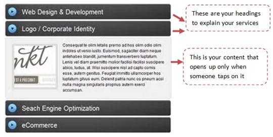
Stacked tabs resemble closely to accordions. They often have small icons(arrow or something) with headings, that expand when tapped by a user and closes when desired. This will not only look good but will restructure your webpage efficiently. Plus, they will turn your super long webpage into small well optimized page which is a pre-requisite for mobiles. Here, I have shared two labelled images to explain everything in detail.
This is the first image that shows an accordion that best suits for the mobile websites of a company that delivers some services.
Another image shown below shows a different way to reorganize content via tabs. This one best suits for a company that sells limited products in some of the domains.
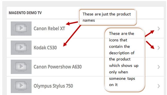
Here you can clearly see the product names being displayed with just a small icon and without the content. Whosoever would like to go through the description of any item, would tap and can see. Notice that how the content has been reorganized to fit in an elegant manner to a small screen space.
c) Include easy navigation features in your inbound pages:
Easy navigation on the mobile is the most important key to fascinate the customers. By this, I mean to optimize the way user hangs around the site by including some icon for moving “backward” or “forward”; or by using breadcrumbs with embedded links to show the navigational hierarchy clearly. This will make sure that the users don’t get lost inside nested pages and can easily find their way to what they are actually looking for. These tips are extremely important while optimizing Mobile UX for ecommerce site.
For example – Just imagine you have a site that sells women apparels. When users will be browsing through thousands of your products and hundreds of categories on their smart-phones, they may come across some designs and suppose a user landed up on actual page and after zooming out she didn’t like the product, where does she go next ? Is it not feasible to have some icons or a breadcrumb for easy navigation that can take her to next product by just tapping once? Don’t you feel it will stick the users around your website for long?? Think of it and you will yourself find an answer!! All this is also a part of Consumer Journey Mapping and the one who can understand the psychology of the customers well will be the real winner of this game on the mobile web cloud.
Top secret 2 – Use some handy tools to analyze your mobile site for “Better UX ”
Tools are your weapons to earn you victory in this cut throat competition. Why deliver such a design that the client comes back to your Manager saying that they are not happy and that they would like to quit the Project. Don’t give a bad experience to your clients and their customers. Analyze before you deliver and fix the issues with the UX. Me and my team here at TIS India often use the below mentioned tools to increase the mobile UX factor for all the clients that we serve.
Google’s Two in One Tool for Better UX –
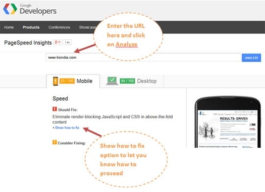
a) Page Speed Insights Tool – This mind blowing tool is from Google and was launched just 7-8 months ago to help web developers take a closer insight on delivering better mobile user experiences. As the name itself suggests, this tool evaluates the speed of your webpage with the aim to make it faster for your customers and offer an excellent browsing experience. Just visit the URL – https://developers.google.com/speed/pagespeed/insights/, enter your web address in the search bar and click the “Analyze” widget. Soon you will see detailed stats in front of you !! The best part here is, there is a “Show how to fix” option for you that describe how to work on better optimization.
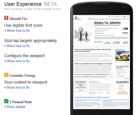
b) User Experience Beta:
When you will scroll below on the same page where you entered the URL as directed above, you will see this User Experience Beta also on the results page along with the Page Speed Insights (that are shown above the fold). Here also, you will see Google telling you some issues and giving guidelines to fix them.
Apart from the two tools listed above, I would suggest you to learn a few more tools and tricks before you start making the websites device friendly. This will not only let you mend your UI but subsequently enhance the UX of your mobile site.
Top Secret 3 – Seek honest feedback : Celebrate the Positive and act on the Negative
Yes, this one is the last but not the least secret to a successful mobile web design. You need to follow the “Customer is King” adage here. Try to seek genuine feedback from the users of your site.
However this is not as easy as it seems to be. So, let me share the idea as to how we do it for our clients here at TIS India. In all the sites that we develop for big brands, we make sure to include a “Leave feedback” page to let the customers themselves describe what they like about the product and what they don’t. Plus, every month we sort out the contact information of the top 100 happy customers (usually from the Subscribers list) that are very active on the site and shoot some exclusive mailers for them asking for their valuable feedback. Here the difference lies in including the most appropriate fields in the feedback form. For this, we make sure to include some fields that ask how did they browse through the services or products – via Tablet, Desktop, Laptop or Mobile?? What did they find good and what bad?? How early they find the desired product on our site?? How many times it happened that they looked for a product and didn’t find anything?? Not just this, there are so many questions that can tell you what is in the minds of the visitors that come on your mobile site.
But unfortunately, I would like to mention here that most of the companies I have come across do this as a marketing gimmick. They track visitors, they collect feedback and they even celebrate the success but they tend to ignore the negative feedbacks. This is where the problem lies. All your efforts will turn unsuccessful the moment you miss out on negative feedbacks collected from genuine users. You need to carefully analyse on the negative and accordingly act on it after careful analysis. And not just this, after every revamp of the site that you do, you need to make it a habit to keep an eagle’s eye on the statistics- whether they are soaring high or falling down!!
The bottom line is :- It’s high time to stop thinking mobile website as just the small version of your desktop site and rushing to meet deadlines with every project that comes in hand. Instead, start planning to specifically enhance the Mobile UX rather than just focusing on optimizing the desktop experience alone. Take care of some basic design notes and consider implementing the best of the tactics to create websites that make life easier for your mobile customers. Give them the charm to relish their browsing journey to an extent that they recommend everyone to avail your service and prompt their friends to buy your product. This is the last golden secret to build a strong customer base and skyrocket your ROI.
This article is written by Sandeep Sharma. He is a creative head at India Designers. He has more than 15 years experience in the web designing domain. He is leading the team of more than 25 web designers in the company. All Web Design Projects of the company start and finish with him.


 Web Developer & SEO Specialist with 15+ years of experience in Open Source Web Development specialized in Joomla & WordPress development. He is also the moderator of this blog "RS Web Solutions".