The development of Internet technology is moving by leaps and bounds. And what was true in web design a few years ago, now seems obsolete and outdated. At this stage, web designers have come to realize that adding a large number of images or text, confusing navigation or a huge mass of various buttons or icons leads the visitor from the main goal.
In place of a lot of information came simplicity of form and the reduction of components.
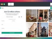
Examples of Successful Minimalist Landing page:
First and foremost you always notice on these pages – they have only one main target. Most often it is by pressing the “Buy”, “Order”, “Enter”, “Download”, etc. One clear, concrete action, that the owner wants to get from the visitor.
You will never meet a difficult website navigation systems, no animation, a large number of striking images, icons of social services. networks and other attributes of distracting the visitor from the main goal.
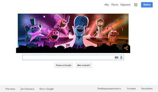
First of all – certainly it’s Google. Page is incredibly simple. There is nothing on it. The main purpose or primary effect of the page – enter a query and click “Search”. That is why this composition takes place in the center of the page, and not just a place, and at times exceed the size of all the other areas of your actions on the page. Of all the other buttons is released “Enter” – alternative action. This is done so that the effect of the alternative on this page is the entrance to the mailbox. The total percentage of the use of these two buttons 98.6%!
DROPBOX
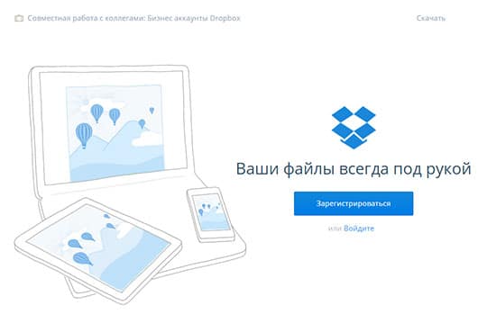
Dropbox is another great example of minimalist Landing page design. On this page, only one call to action. The main goal – the registration of the new user by pressing the button «Sign up». That is why this is the brightest button on the page that attracts the most attention. Everything else, including the logo and company name, muted and is not as important.
Of course, there are also alternative secondary action. Consider presented alternative actions and explain why they are secondary. «Sign in» – aim to attract new visitors to the page, and if you are already registered, then it is not the main goal. «Learn more» – you can find more information about the product, but by then you will still wait pressing the button «Sign up». All these elements are arranged and configured so (deleted and muted), so as not to distract attention from the main goal of «Sign up».
For more information and benefits are available for the scrolls. The main advantages are highlighted in bold and bright finishes Page button «Sign up». People do not always have time to read about the benefits of extended texts, so often used diagonal reading and the brain perceives the page in the form: “Wherever you are” – “Share with confidence” – “It is safe» – «Dropbox Business» – Sign up.
VIBER
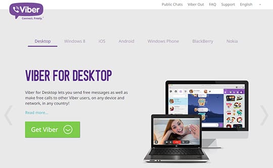
Another fine example of excellent Landing page in a minimalist style is Viber.
The desired action on the page – «Get Viber». This button is clearly highlighted. It is worth noting that the green color, the color button is not used anywhere else on the site, even if you’ve followed many alternative paths and were lost on the site – the green button «Get Viber» always remind you of what is expected of you on this site.
Achieving the goal is reduced to only two clicks of the mouse. You choose the platform and click «Get Viber». Everything! Two clicks and you have reached the desired site owner. No scrolls, no useless information, no time-consuming.
OPERA
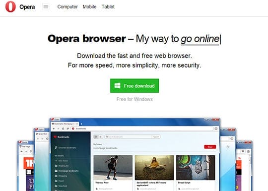
Consider another example of successful minimalist Landing page. This is Opera.
A brief but informative description of what you will get by clicking «Free download» and the button itself «Free download», which is the main goal – the most notable items on the site. The logo, the name of the site and navigation elements are located at the top and bottom of the site and visually muted, without attracting attention.
How to build your own minimalist Landing page website:
Minimalist Landing page design includes 3 main components:
- Primary action
- Very short description (one short sentence) of the product or service
- Alternative action.
- Size: the bigger, the better. But of course within reasonable limits
- Status: often the primary action is placed at the top or left side of the page; or in the center.
- Color contrast: highlighting relative to other elements
- Spaces: the allocation of space on the page around the main target
Start designing Landing page by selecting a main goal. It could be anything, depending on the focus of your site “Download”, “Date”, “Buy”, “Like” and etc. And then add the rest of the elements that should contribute to the allocation of the main objectives and implement the necessary actions.
Minimalist Landing Page – Conclusion:
As you can see from this article, it is the way of simplicity is success Landing page. Removing a bunch of additional and unnecessary content and elements you focus visitors’ attention on the main goal, which is most important in order to achieve that, and you have created this page.
And what are the trends in web design popular in your area?
This article is written by Vadim Kononyuk. He is currently associated with an international web design and online marketing agency Anvers Media.