It goes without saying that ‘About Us’ is indeed the most crucial page of your website. With so many ideas available for designing the ‘About Us’ page, web designers often tend to get confused about choosing the right one. Finding the right idea for designing the ‘About Us’ page is actually the stepping stone towards a progressive business. Hence, if you too are keen on designing the perfect ‘About Us’ page for your website, there is a set of ideas you need to stay away from. So, without any further ado, let me walk you through these 10 worst web design ideas that need to be ditched by web designers who are planning to create an amazing ‘About Us’ page of a website.
Worst Web Design Idea #1 – Not writing huge chunks of texts
The more information you include on the site’s About Us page, the better it would be for your potential clients to trust you. Whatever you’re inclined on sharing with your customers must be well mentioned on the ‘About Us’ page. Don’t forget to proofread this text for any kind of grammatical or spelling errors.
Worst Web Design Idea #2 – Not using rich color palette
Whether you’re creating the About Us page or any other page, make sure to use a variety of colors. The more the count of colors used in the web design, the better your visitors will feel about your website. Also, don’t forget to include gradient effects and textures into your web design.
Worst Web Design Idea #3 – Using unlimited site wide links
Although Google loves site wide links, overdoing it can harm your site’s reputation and lead your business towards the route to failure. Filling your ‘About Us’ page with links is a great idea but never overdo it. Always keep in mind that you need to keep your website away from a Google penalty.
Worst Web Design Idea #4 – Hiding the contact details
About Us is that page of your website which is accessed the very moment someone visits your site. If you haven’t included the required contact details in this page, there are positive chances that the visitors will lose their interest in exploring your site further. They’ll probably feel that a corporate site without appropriate contact information might be a fake.
Worst Web Design Idea #5 – Coloring the truth
Never ever opt for this web design approach. People on the internet want to hear the truth about a company. By indulging in emotional speaking on your ‘About Us’ page, people will perhaps catch you and choose not to work with your company.
Worst Web Design Idea #6 – Using images from Google images
Google clearly remembers each and every picture that is saved into its database. Hence, fetching images from Google will easily invite legal trouble for your business website. Ask your web designer to create 100% unique images to prevent any sort of copyright issues at a later point of time.
Worst Web Design Idea #7 – Adding Advertising flash banners
This is a web design idea that can easily ruin all your hardwork of creating a truly amazing About Us page. There’s no point confusing your visitors with excessive animations. Hence, make sure to keep your site’s About Us page as simple and less colorful as possible. Advertising banners always pose as an obstruction and must be avoided as a whole.
Worst Web Design Idea #8 – Not paying heed to the latest web design trends
A good majority of web designers is into the habit of designing About Us page using the traditional trends. This is something that has been holding back the web designers from achieving web design excellence. If you want to create an About Us page that stands out from the crowd, following the latest web design trends becomes a must.
Worst Web Design Idea #9 – Adding a lot of fake testimonials
Testimonials play a pivotal role in helping a visitor decide to make a purchase with you. By including a lot of self-written testimonials on the website’s About Us page, you’re probably reducing the amount of trust that visitors might have in you and your company.
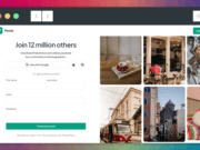
Worst Web Design Idea #10 – Displaying your eagerness of converting visitors into leads
Most of the corporate professionals lag behind in the race of website conversions simply because they make their site’s About Us page a tool for forcing people to make purchases. While some people aren’t able to detect this intention, others simply get turned off and choose to stay away.
Conclusion:
Now, you’ve them all, the 10 bad web design ideas for creating a website’s About Us page. Hope you’d have loved reading this post. My sole aim of highlighting these web design ideas was to make sure you never follow the same during your ‘About Us’ page designing projects.
Please don’t forget to share your views/opinions on the above post, using the comments box below.
This article is written by Liza Williams. She is a web developer by profession and a writer by hobby and works for WordPrax Ltd. - PSD to WordPress company. She loves sharing information regarding WordPress customization tips & tricks.