No one has time to surf your site upside-down (except your competitors of course), hoping to find the things they need.
No matter which site page your visitors land on, it’s exactly the navigation that keeps them engaged, by driving to the desired place.
Even more, website’s navigation greatly affects traffic and conversions. And here is why:
- A good navigation structure means better crawling and higher rankings.
- The easier it’s for shoppers to find what they need, the higher your chances to convert visitors into customers.
In this article, we are going to discuss 5 widely spread navigation mistakes that can break your eCommerce business.
1. Navigation Experiments
Unusual navigation is quite a risky thing. Designers keep playing with it and put menus in a new or unexpected place or hide it under the ‘hamburger icon’ (2015 trend).
However, most customers expect to see an old familiar navigation across the top or at the left side of your website. Because it’s easy and clear.
And your main goal, as an eCommerce entrepreneur, should be: not to showcase the most extraordinary way of website surfing, but to help customers find what they need quickly.
However, if you are selling unique products or your store is dedicated to some unique service, you can make the exception and try to experiment with different navigation patterns. The only thing: it should be intuitive and clear.
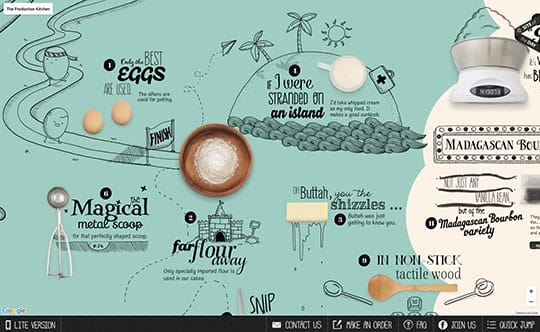
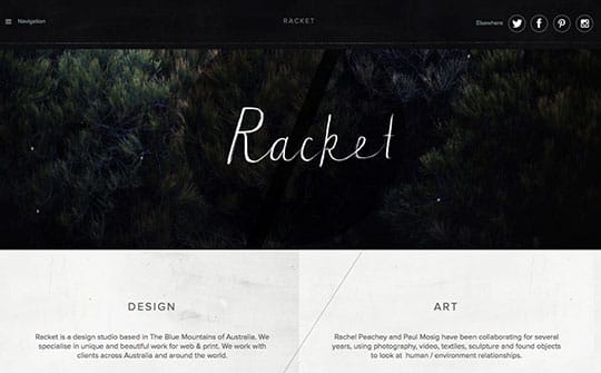
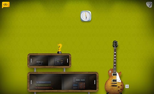
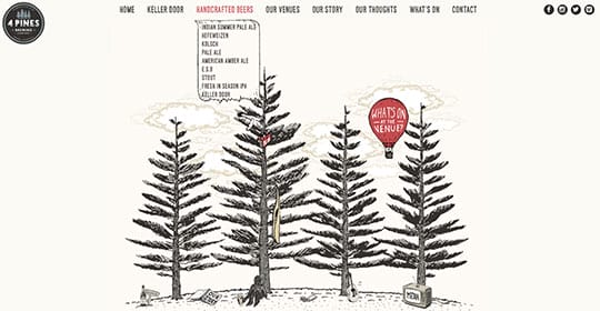
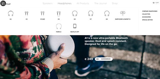
Below you can find a few examples of unusual navigation.
Jacquico
Racket
Alexbuga
2. Generic Labels
Navigation labels are not just words placed on navigation links. They are important components both for search engines and site visitors. Let me explain why:
- Good for search engines. Since no one search for generic ‘products’ or ‘services’, using labels with keyword phrases can affect rankings. Also, descriptive labeling creates a high- quality internal linking structure.
- Good for customers. Don’t make people solve a puzzle. Obvious and descriptive navigation labels help customers save the click and get instantly where they want. For you, it means lower bounce rate and higher CTR.
Remember: Users often hesitate to click on the labels that are too broad. Because generic names have no information impact.
Bonus Tip. A perfect labeling formula includes:
- Keywords-rich, clear, simple and descriptive labels,
- Making each label reflect the real link behind it,
- Consistent labeling style (g. try to keep labels of similar length and grammar structure: news and blog, research and insights, etc.).
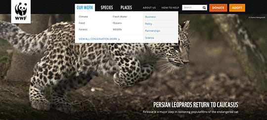
3. Dropdown Menus
Drop-down menus are commonplace. And they are the cornerstone of UX until they’re used right.
- Drop-downs are annoying. Yes, but only if a drop-down on your website disappears every time a customer slightly moves the cursor from the track?
- They can’t function on phones and tablets. What’s the problem? Create a responsive and touch-friendly variant.
- They create the paradox of choice. Subdivide products by categories, include images, create sections ‘What’s New’, ‘Featured’ or ‘Sale’ to drive customers’ attention.
- Drop-downs are hard to crawl and index? Include a keyword phrase for each category and link.
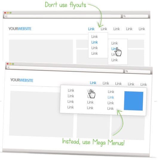
- Don’t use Fly-Outs, use Mega Menus.
Hence, if drop-down menus are structured correctly – they can become a helpful navigation tool. Here are some examples how to make controversial and messy drop-downs work for you.

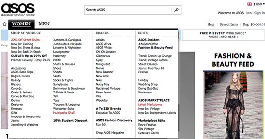
4. Too Many Navigation Items
Quite a large number of stores have vertical navigation – because you can add as many links there as you wish. In this case, the homepage starts looking as a sitemap with dozens of links leading to different categories and products.
Too many items in the main menu scatter customers’ attention.
Removing less important sections and elements make people focus on most important links. No matter how many categories you have and how many pages you want to cross link – don’t ask customers to spend their time on your all-in-one menu with 50 links.
Even more, the excessive number of links on the main page dilutes all the link juice and lowers the authority of the main page.
To sum it up. Don’t overstuff your menu. Organize your content concise, simple and clear for your customers – not you.
5. Navigation Items Wrong Order
Psychological studies show that items that appear at the beginning and at the end are more effective than ones in the middle. That is connected with short-term memory.
![]()
Put the most important sections/products at the beginning and the least one in the middle.
Bottom-Line
Navigation mistakes can cost you much. Don’t make your visitors too difficult to find your products. Make it easy, intuitive and simple. Thus, you will not only get a lower bounce rate and longer visit duration – you will get better SEO rankings and higher sales.
Did we forget anything? Feel free to share your navigation pain points in the comments below.
This article is written by Natalie Pavlovskaya. She is a Marketing Executive at MageWorx.Com, Magento 2 Extensions developer. A passionate marketer by day and a copywriter by night, she is here to speak all things ecommerce, UX, digital marketing and social media. The Rolling Stones addict. Follow her on Twitter.
 This article is written by Natalie Pavlovskaya. She is a Marketing Executive at