In this fast paced wave of technology, E-commerce is growing rapidly. Considering the momentum of E-commerce evolution, it is expected to break the imagination of success for those who are in this business. E-commerce has made things really easy for the consumers to indulge in a unique shopping experience.
But let’s face it; shopping on mobile devices can get really tricky as the entire shopping experience is narrowed down. Instead of fighting against this limitation, the best way is to embrace it and optimize the same.
Most often or not it happens, that, in the process of giving wholesome shopping experience, businesses and developers fall into the trap of cluttering an app. This makes things really counterproductive. Instead, it is wise to offer a shopping experience which is light, product/service-centric, and information rich.

Therefore, it is necessary to know how well the users can indulge in an altogether intuitive shopping experience. For this, here are 5 killer tips to boost the Ecommerce app user experience.
1. The interface should be clear and de-cluttered
 It is always advisable to get the basics right. The first and the foremost thing which users will encounter in an app is how it appears. So, the best thing is to de-clutter the interface and make it clearer. M-Shopping is always experienced best when it is product-driven.
The idea over here is to allow users to skim through the repertoire of product catalogs easily. Ease of navigation is always appreciated by users as this eliminates unnecessary navigation options, superfluous information, and redundant promotions.
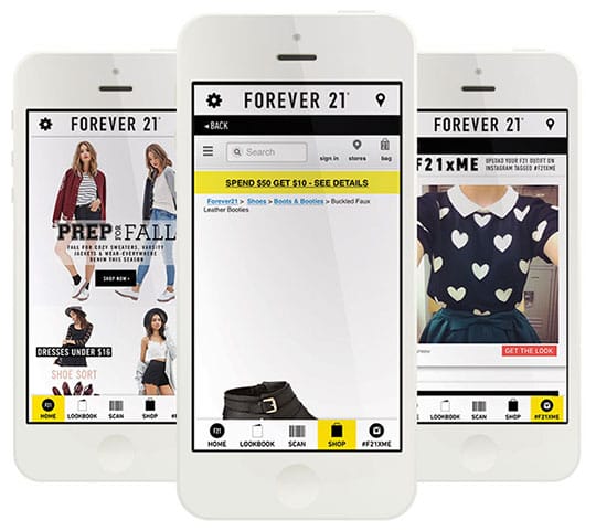
Let us see WHAT WENT WRONG with Forever 21’s mobile app in terms of interface cluttering. It comes loaded with multiple navigation options which include breadcrumbs or say, just a single horizontal tab. The navigation itself is a waste of space and kind of a shopping disaster. What went wrong over here is the app’s focus. The focus is more on gratuitous things like promotions, selfies, and lookbooks.
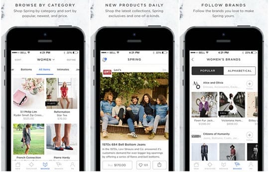
On the other end, there is a Spring app. Spring offer Instagram-like pictures in their product catalog to make a purchase from. It easily serves the purpose of displaying the products and does it creatively. The navigation is simple and easy to access. Moreover, it is due the minimalistic interface, it loads faster and contributes to enhancing UX.
2. Product photographs must be visible and of a high quality
 Here is the chance to either leverage on the small screen size of mobile phones. When mobile phones have tiny screens, the product photos should not be smaller. Nothing annoys shoppers more than the pixilated and small pictures.
True, there is a certain amount of difficulty in shopping via mobile phones. As mentioned earlier, an eCommerce app development should embrace this limitation by focusing more on the products by providing sharper, bigger, and beautiful pictures.
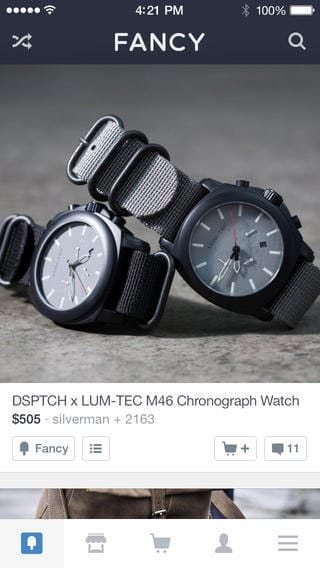
One of the best examples of an eCommerce app focusing on pictures and the overall app usability is Fancy app. This app provides big, full-width, and yet, detailed pictures of the products. The browsing experience is enhanced with the display of clear product pictures. Fancy comes with a stock of high-quality photos and the same are presented magnificently.
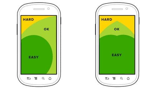
3. Always follow the rule of thumb: Focus on thumb-friendly zone
 When it comes to right-hand vs left-hand debate, mobile phone users are found to be very flexible. According to one survey, “about 2/3 of users used their right thumb on the screen, and 1/3 used their left thumb.” So considering this fact in mind, E-commerce apps must be built wherein it is easy for customers to navigate and drives better CTA.
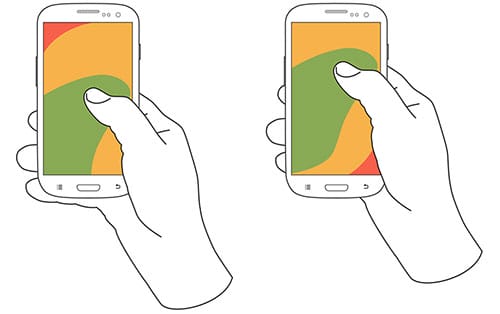
It is very important to ensure that important tasks and Call to Action buttons falls under the thumb-friendly area. This eventually leads to an effective conversion rate. One more observation is that gradual increase in smartphone screen size will further shrink the thumb-friendly area down lower on the screen.
4. An easy-to-find global navigation
 Perhaps, easily the most important element in the UX of E-Commerce website – global navigation. The opening screen is something which serves as a guide-map for the users. This enables the visitors to search the content and products they are interested in.
Considering that mobile app is very compact in nature and size, it is pretty natural to argue that it requires a lot of scrolling. But, the purpose is to engage users with interactive global navigation so that users can easily get what they are looking for.
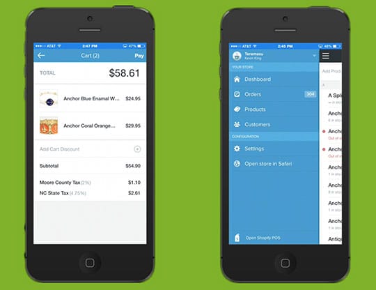
Take a look at the Shopify app which integrates flat design with the global navigation button for enhanced interactivity and stickiness.
5. Integrated Vibrant basket blended with easy checkout
 A customer who has added the products in a basket and is sure to buy it will proceed to the checkout. Here, the user has made a decision to buy the product and therefore the task is to make the entire process – from adding an item to the basket to order confirmation should be seamless.
The crucial thing over here is not to annoy users during the checkout. Once, the purchase decision is made, the job is to simplify the checkout process by redirecting the order to payment gateway easily.
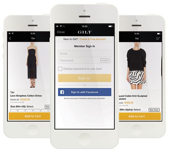
Gilt is one such app which just annoys the user to an extent that buying decisions are affected adversely. Gilt asks users to log in before adding the product to the basket. So, when the user adds something to a basket, they are asked to either log in or sign up.
Not only this but once the user tap on the icon button – they are prompted to log in again. The entire shopping experience jeopardize over here as it makes harder and confusing for users to purchase the product.
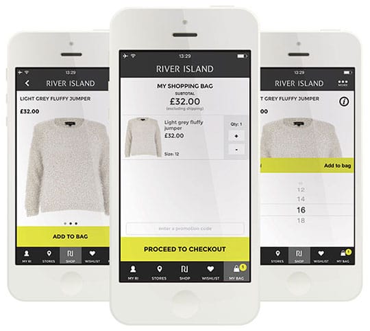
On the contrary, the River Island app offers delightful checkout process. The shopping basket provides clear UI and displays the purchased product clearly. The exit page on the app clearly displays the product pricing on top and the pretty bulbous checkout button below.
Each and every specifics of the item is clearly described so that users can just reaffirm the purchase decision and proceed to checkout easily.
 The whole idea of eCommerce app is to boost sales and to garner greater revenue. But this is only possible when things are presented to users in simplest, and yet effective way. In order to boost up sales through eCommerce app, it is necessary to boost up the overall UX by offering not only products but a remarkable shopping experience.
This article is written by Shahid Abbasi. He is a marketing consultant with Peerbits, one of the top mobile app companies for iOS and Android app development. Shahid likes to keep busy with his team and to provide top-notch mobility solutions for enterprises and startups.